Resources / Colour Lab Guide
Colour Lab Guide
What you need to know
All the other stuff
Quick start§
1¶ The easiest way to get started with your Riso print is to drag and drop your image into the main area, this will start it off as a greyscale image, or use whichever inks colours you currently have selected.
As shown with this amazing flower illustration down below.

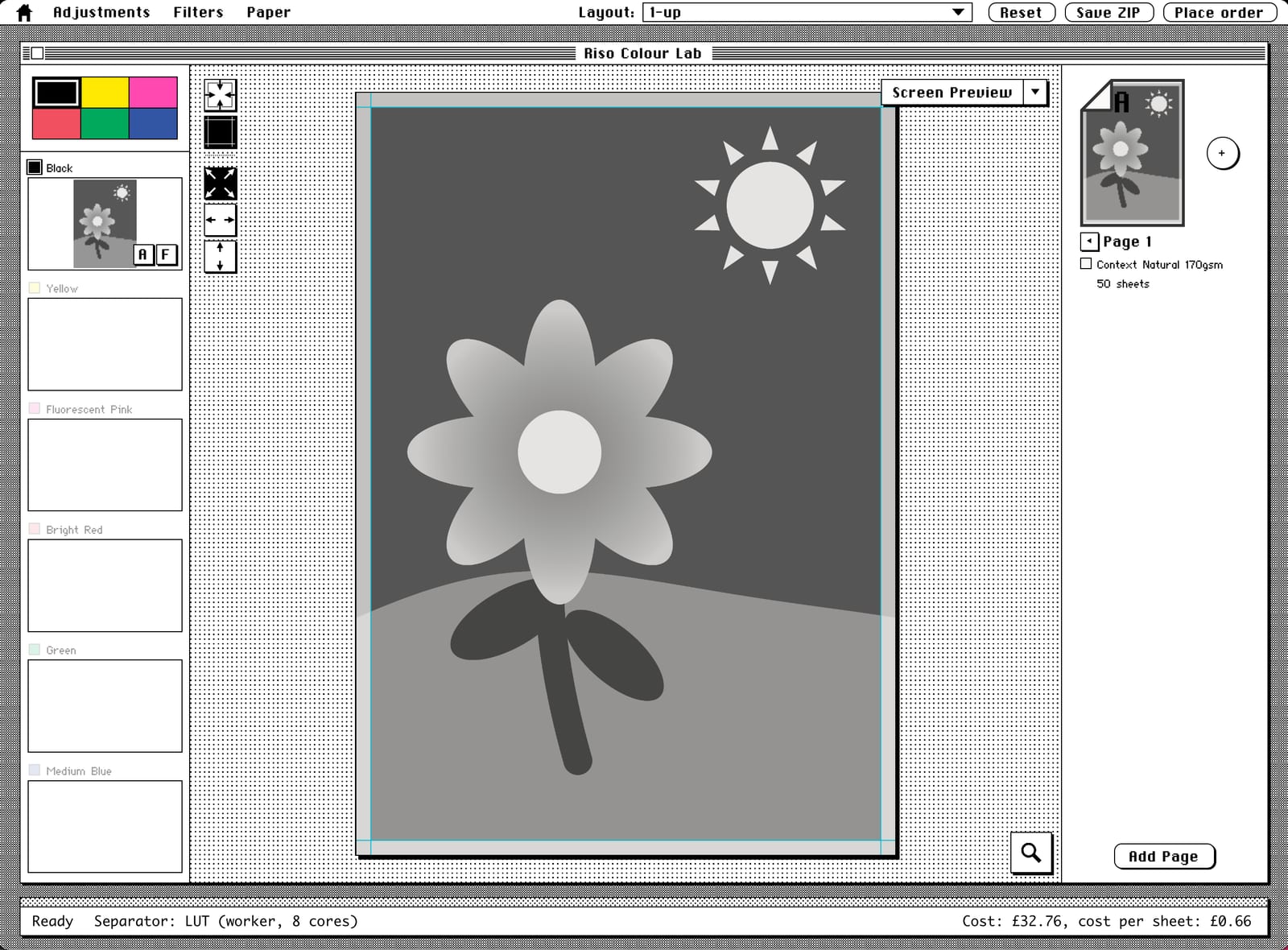
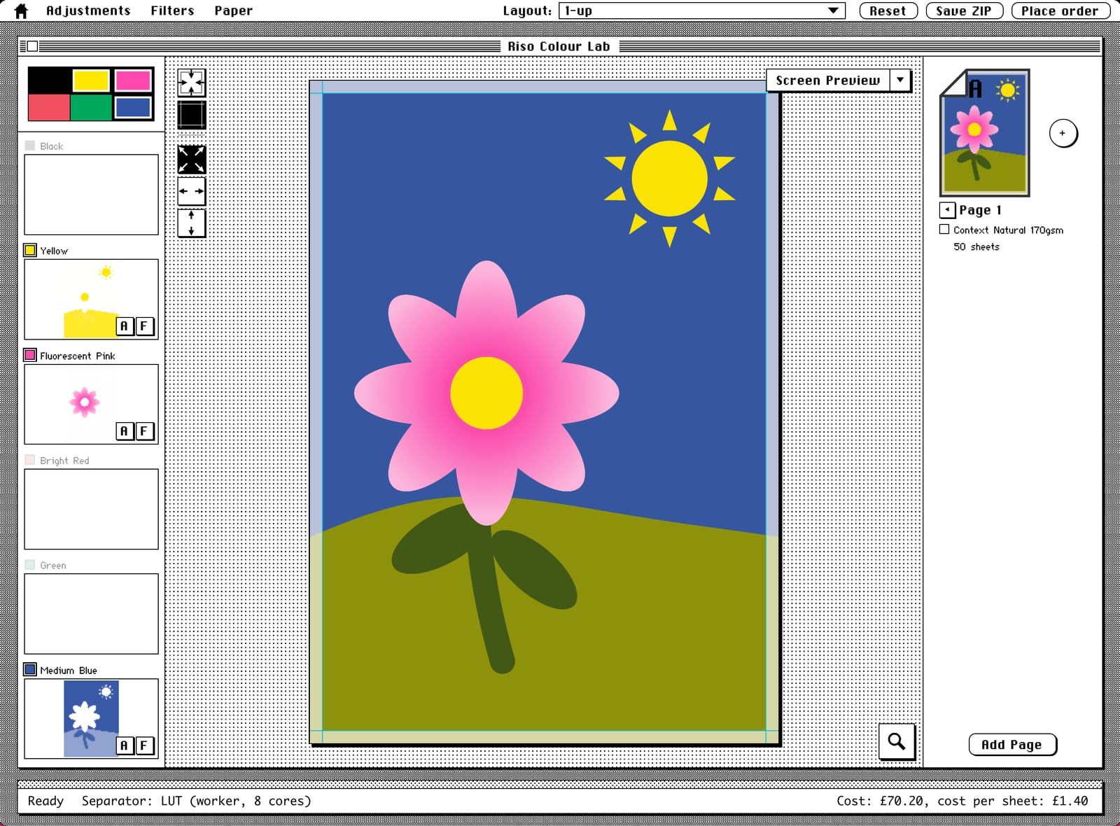
Once your image is uploaded, you can toggle ink colours on and off until and it'll recalculate the colour separation.
The example below shows us using yellow, pink and blue for the flower, and a classic duotone for the photo on the right.
The Colour Lab will do its best to split the design into different coloured plates (the inks that would be used for printing).
Our Riso printer doesn't print right to the edge of a sheet of paper, it has to have an 8 mm margin around the edge. So there's a few controls to help you handle that.
-
If, like these two examples, the flower or the photo don't have a margin already baked into the design, clicking the first icon will fit the image to the margins. If you've already added margins into your design, you can leave it filling the whole page.
-
The second icon toggles on and off. These won't appear on your final print.
The next three are how your design is fitted onto the page.
-
The default one just scales the design to fit either the whole page or within the margins.
-
This one makes sure the whole width of your image is displayed, which may crop off some of the top and bottom.
-
The last icon will make it fit vertically.
As you try out the different settings the page will show you which parts of the design won't be printed by fading them out.
2¶ Let's say you're happy with the colours. The next thing to do is select Print Preview from the drop down.
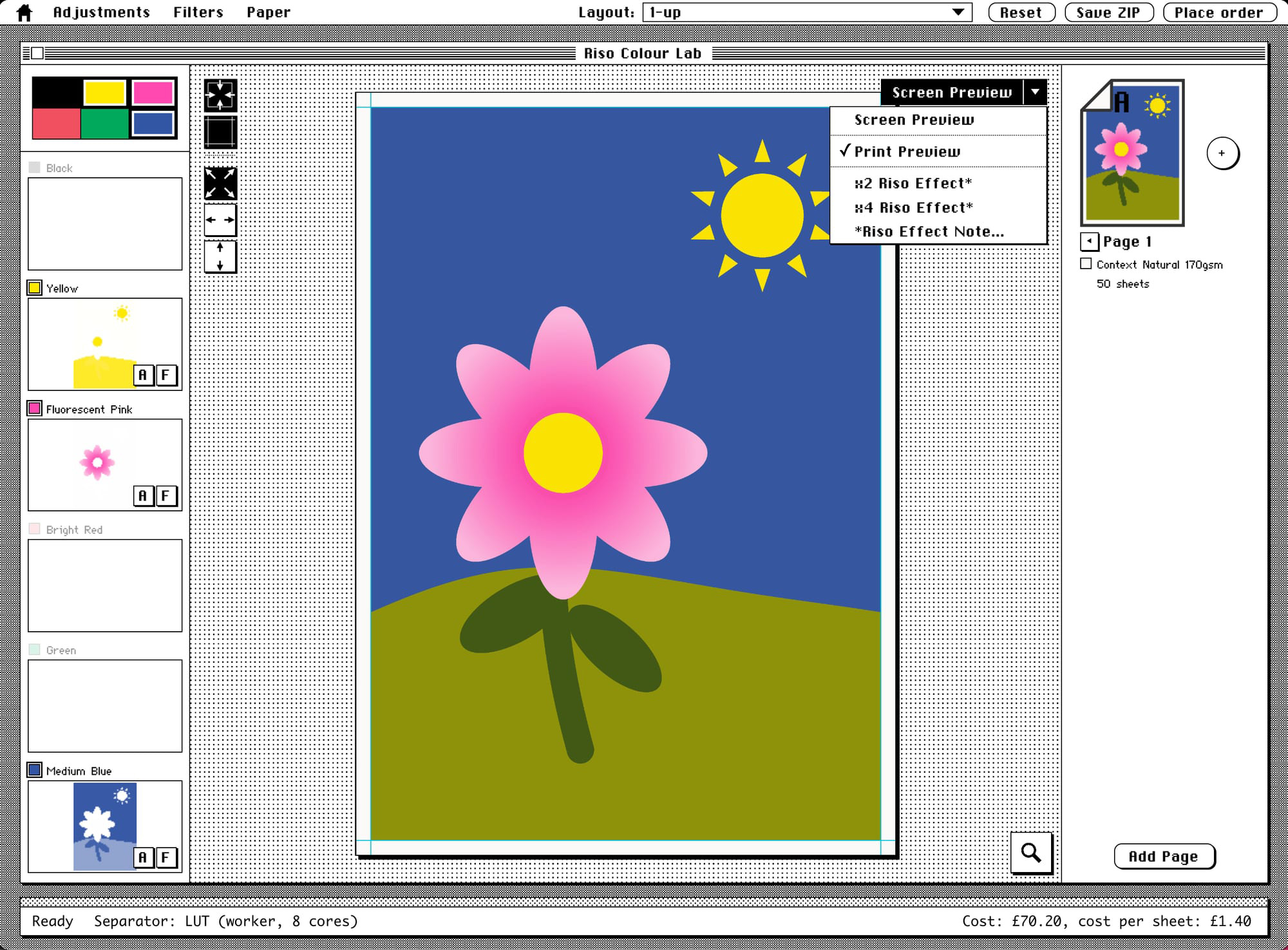
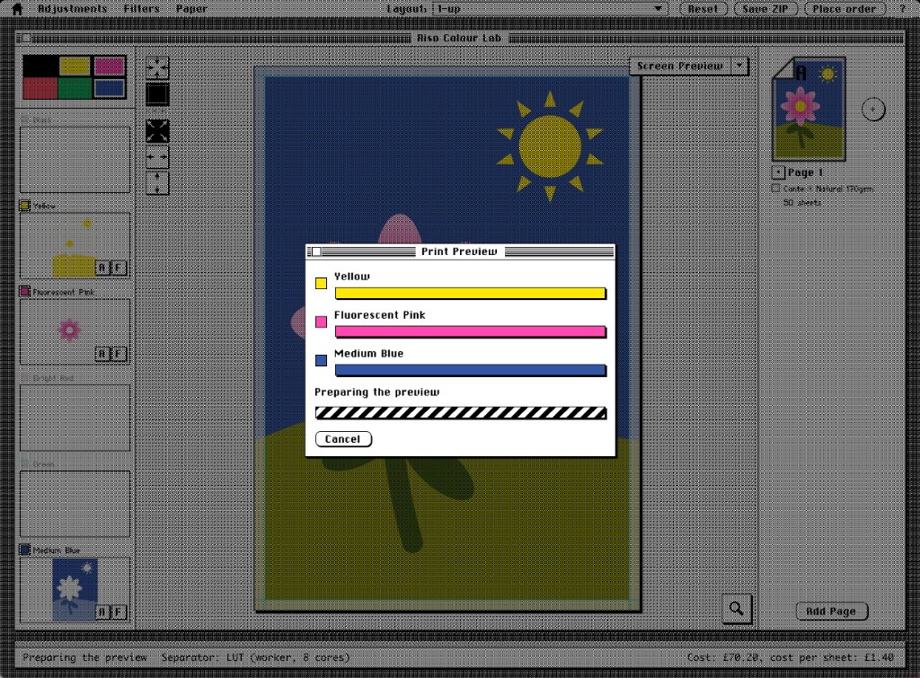
This will ask you if you're okay uploading the image to the server, where the whole thing is going to get processed. You can read more about that over on the About the Colour Lab page.
This will create a preview based on actual scans of prints run off our Riso printer.
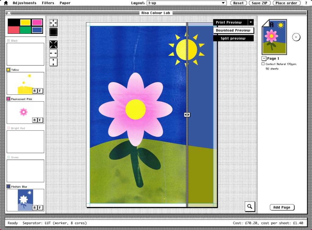
3¶ Assuming that you are happy with everything (and down below we'll go into more details about how you can make adjustments and tweaks), you can see the total price that it will take to print down in the bottom right hand corner.
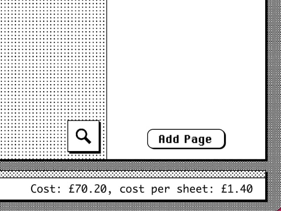
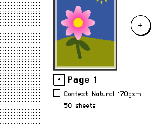
Over on the right hand side you can add a B side to the page if you want to print on both sides, and you can also add pages if you want more.
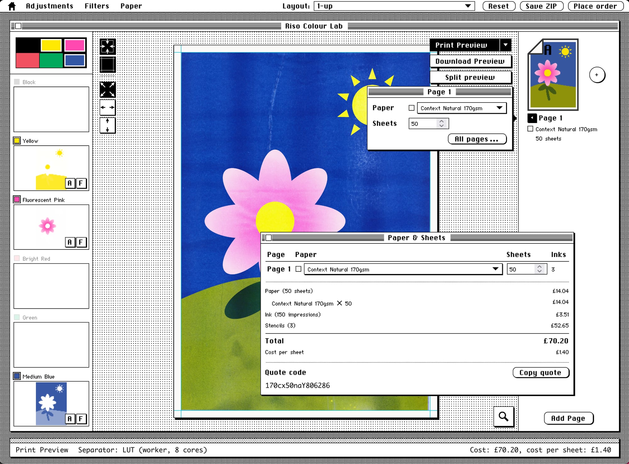
There's a little flyout menu ⏴ next to the page that will pop out the ability to change the paper and the number of sheets, this'll also update the prices.
You can get more detailed information by clicking on All pages, or the cost down the bottom, which will pop open the Paper & Sheets dialogue box.
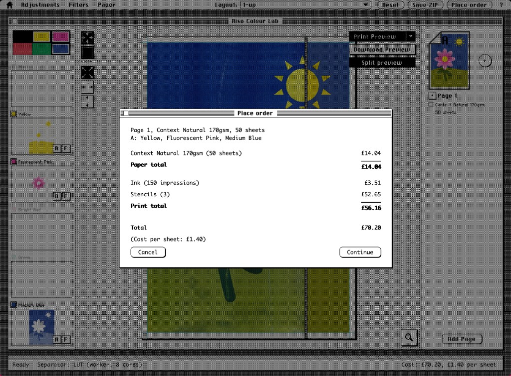
4¶ Press the Place order button in the top right hand corner, check the price breakdown, and follow the instructions.
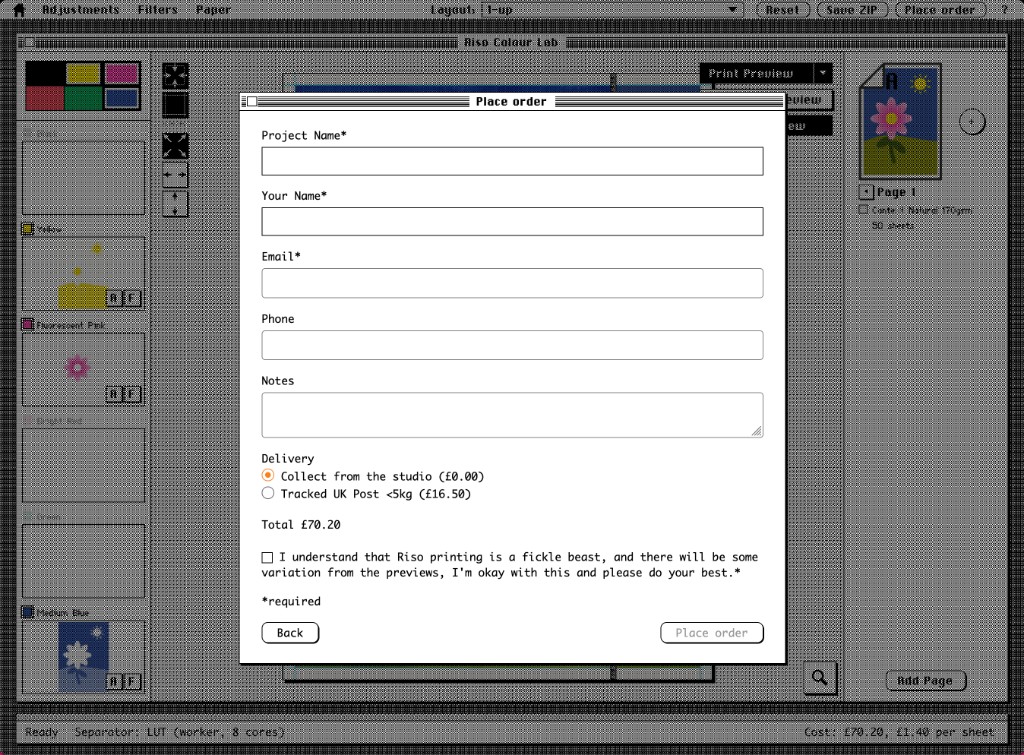
We only ship to the UK. If you're not in the UK, or don't want to print with us, click "Save ZIP" instead. That gives you the colour separated layers, and the print preview if you've created one. You can use those with a different printer.
Otherwise, fill out the form to place the order, and we will get on with printing it.
Print days are Tuesdays and Thursdays. Sometimes the prints need to be left to dry between layers, and before posting, to reduce small smudging and ink transfer.
That is the whole process, from start to end, of creating a Riso print order with us.
Adding pages§
We can print two-sided. Although to reduce smudging we leave it a couple of days before printing the second side. We also suggest less ink-heavy designs for two-sided thinner paper.
You can add a second side to a sheet of paper by pressing the plus button next to the current page, that gives you a "B side".
If you want to add a whole new page, you click Add Page. Different pages can use different ink colours, and even be different orientations and different paper types.
To remove a page, hover over the page and press the little X in the corner.
Layout§
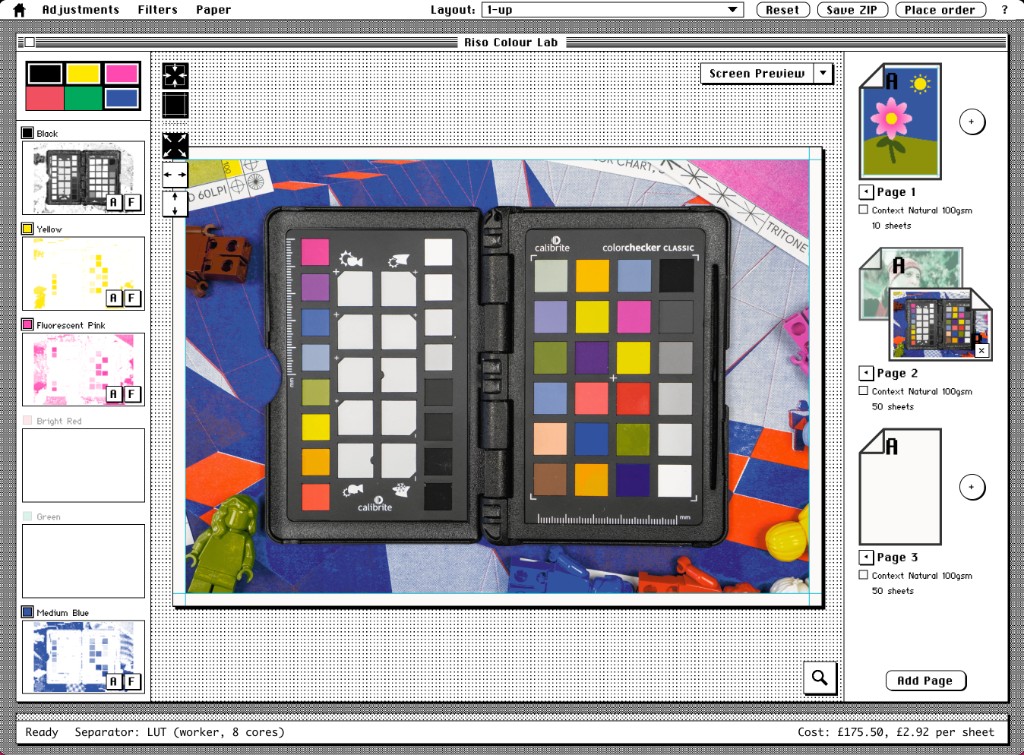
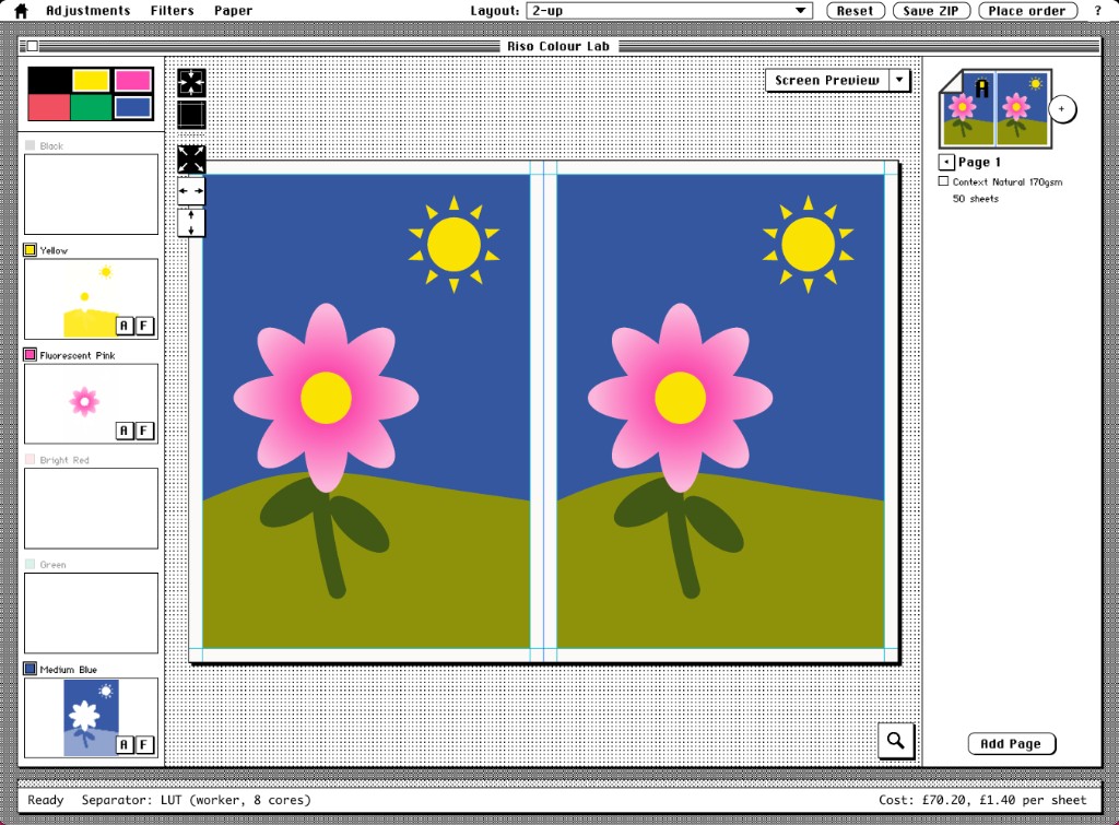
Our machine prints onto A3 sheets, and only A3 sheets. You can use the layout drop down to quickly change a design to various spreads and layouts. For example, quickly switching to two A4 designs, and various other arrangements.
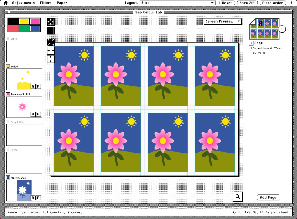
You could also use print preview to get an idea for how it may print. And there is a lot of alternate layouts that could be handy.
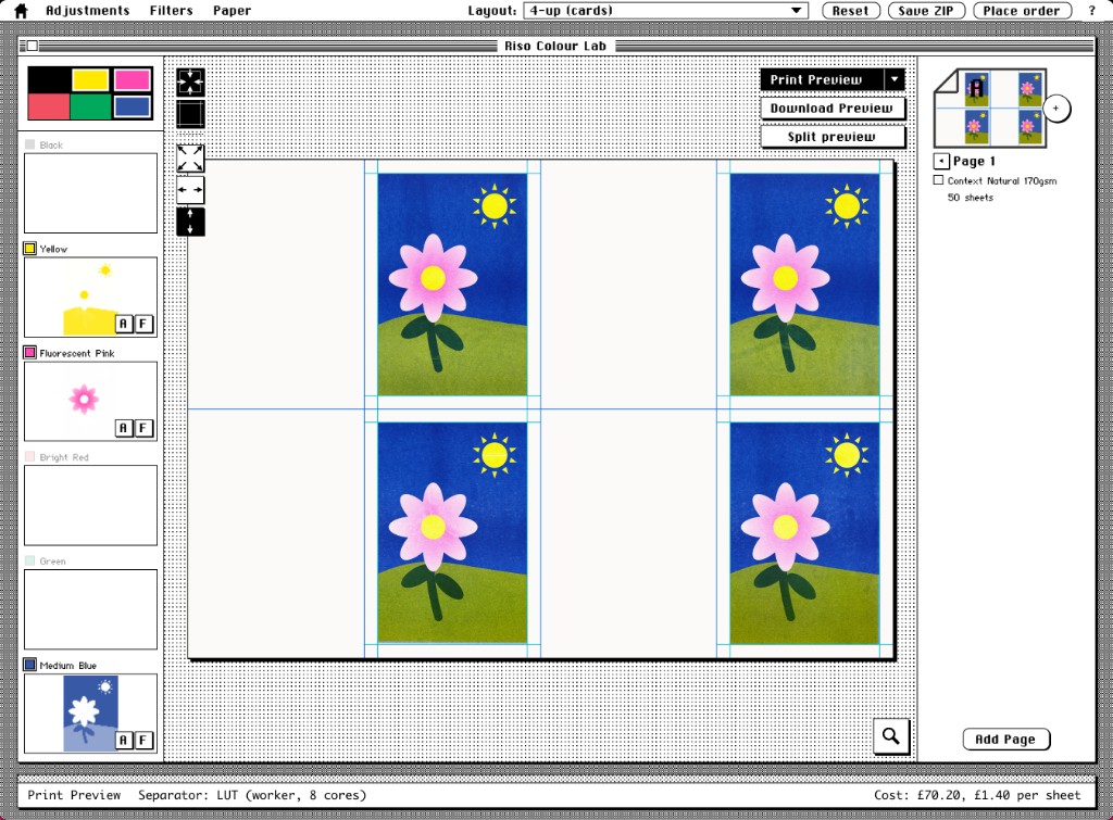
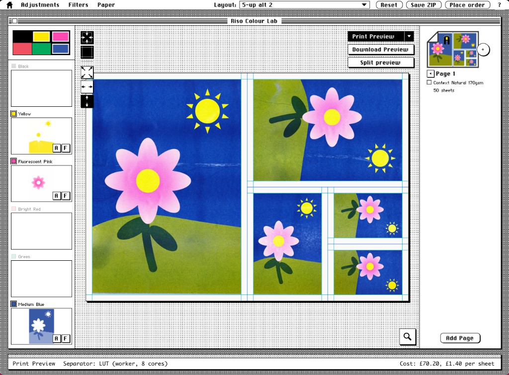
Please note due to the way Riso prints, different layers can come through slightly skew, and while we can adjust the best we can for alignment, when you start getting to four or eight per page, some of them on a page will tend to have better alignment than others. There will be variation in how much things are offset.
Please also note we always ship prints uncut, and we don't offer a trimming service. This is mainly because it's just easier for us to store, handle and package A3 paper.
Adjustments§
The above section was a quick end to end about processing an image. There's a good chance that you want to make some adjustments.
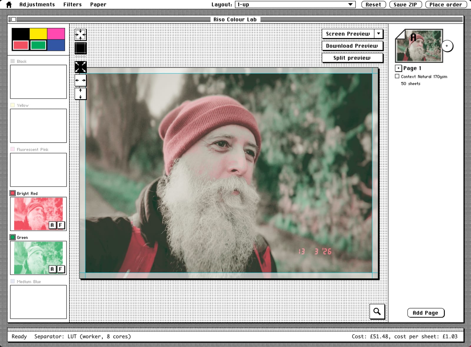
So let's use the red-green duotone image as an example. Here I've dropped in a photo of me with all the default settings.
So the screen preview looks fine, but it's not always the 'truthiest' preview. Selecting the print preview from the preview dropdown gets us closer to the end result.
Sometimes the screen preview is pretty close, but as you can see in this one, because our bright red ink is so strong, our end result is overwhelmingly red.
We've also adjusted the image to fit within the margins because we're using a full bleed photo.
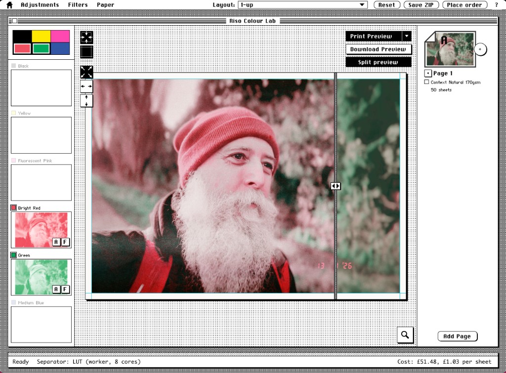
There's a couple of ways we can start adjusting the image.
The first is with Adjustments, where we can either go up to the Adjustments menu and pick the one we want. Levels is normally a good one to start with. We'll cover curves in a second.
Or you can go to each layer and press the A button to get to adjustments for that layer.
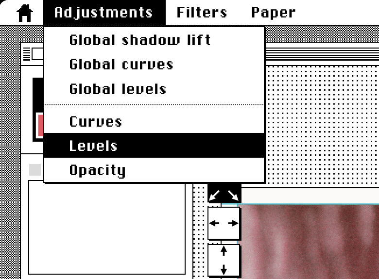
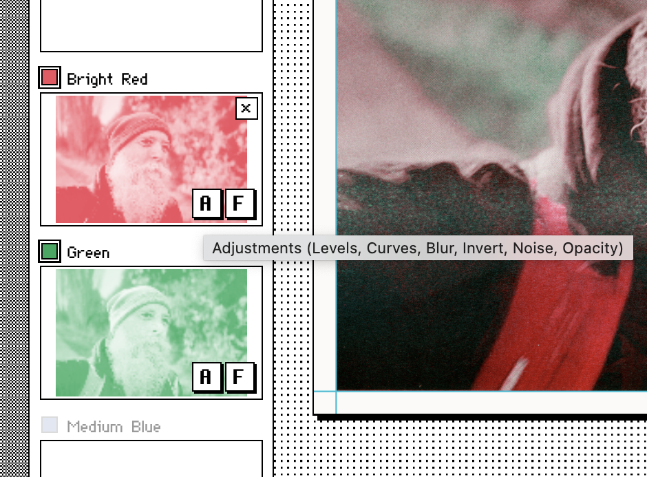
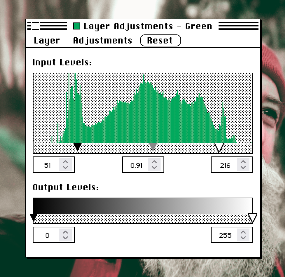
A good way of starting is to adjust the arrows under the histogram to kind of where the histogram starts and ends. That will spread the colours more evenly, all the way from dark to light.
In the case of the green histogram, I've brought the line just to the right of the peak amount of darkness, and the upper end to just to the left of the lighter peak, and dragged the middle slightly closer to the bulge in the middle. That's generally a good starting approach.
With the red adjustments, our red ink is actually very vivid. It's called Bright Red, and the ink goes down quite thick. It's one of the inks that takes the longest to dry. As we can see from the default settings, it can sometimes become too dominant.
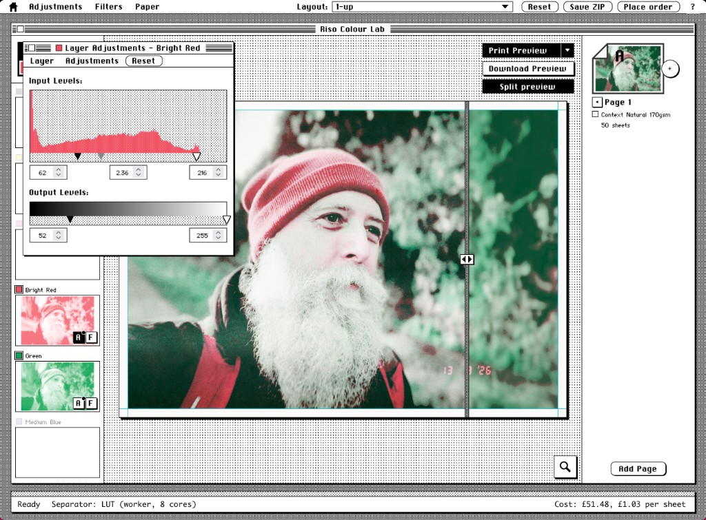
So here I've tried to reduce the amount of dark red used, by shifting it slightly lighter. Moving that middle arrow closer towards the dark arrow means that I actually want everything to the right of it to be in the lighter half, and reduce the amount of darkness. Then in the output level I've brought that up, so we are getting rid of the darkest parts of the red ink.
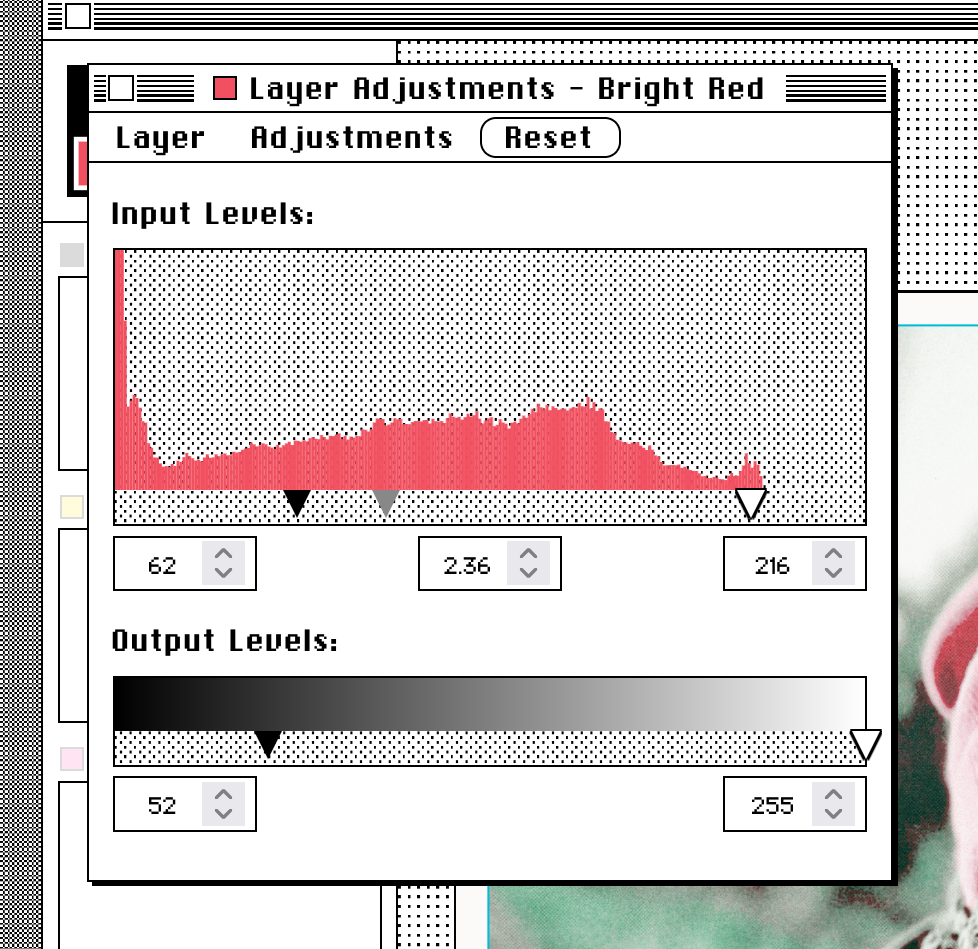
And now if I have a look at the end result and do a print preview, I can see that I have knocked the red back quite a lot in the print preview, compared to the original which you can see in the second image.
We have another couple of adjustments that you may or may not be familiar with. If you really wanted to get into the weeds of adjusting the colour balance, the first one is curves.
So here's the classic S-curve, which lightens the highlights and darkens the shadows to give more contrast, and the second one, which is an inverse S-curve, which is reducing the contrast.
And we also have opacity, which just reduces the amount of ink used in the whole layer.


Already separated layers§
It's very possible that you have already prepared your files for Riso printing, or used another tool like Spectrolite, and you already have the colour layers ready to go.
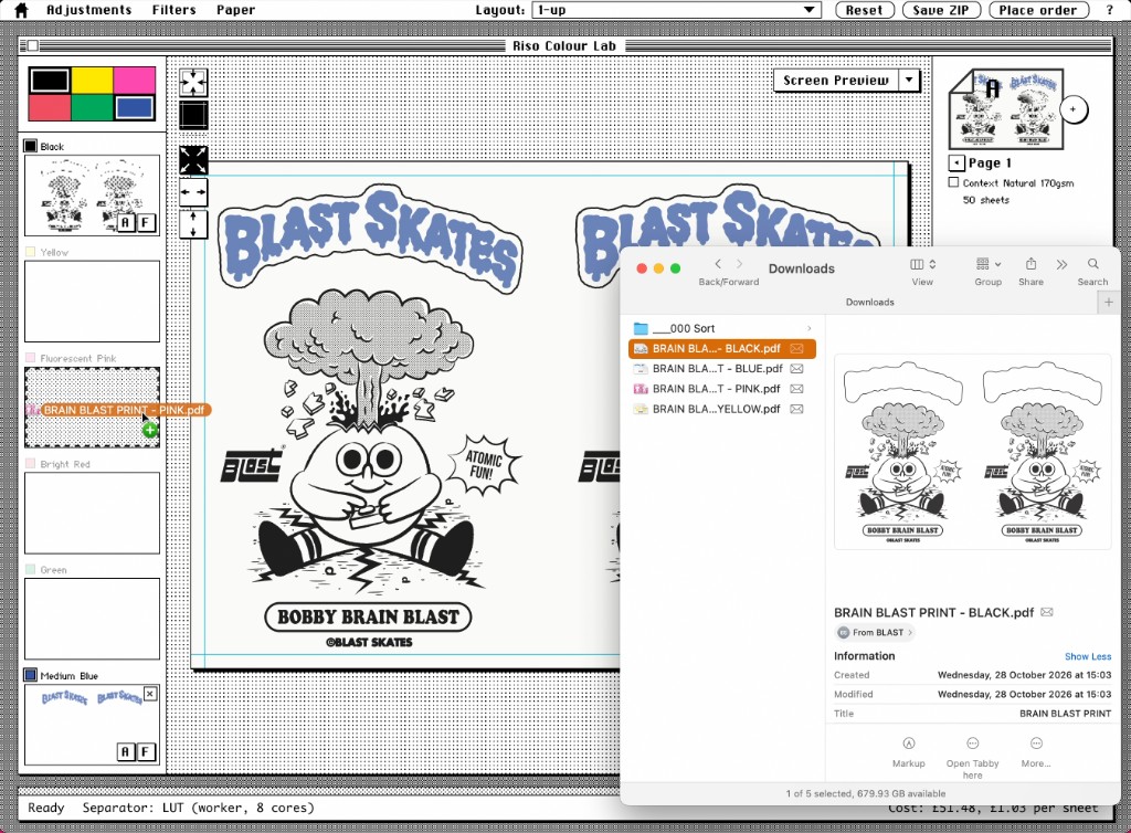
You can drag these into the layer thumbnails over on the left directly.
So here are four files, downloaded from email, in PDF format. We do JPEG, PNG and PDF. We'll only read the first page of a PDF, and we can drag each one over into its layer to get the result you see on the right.
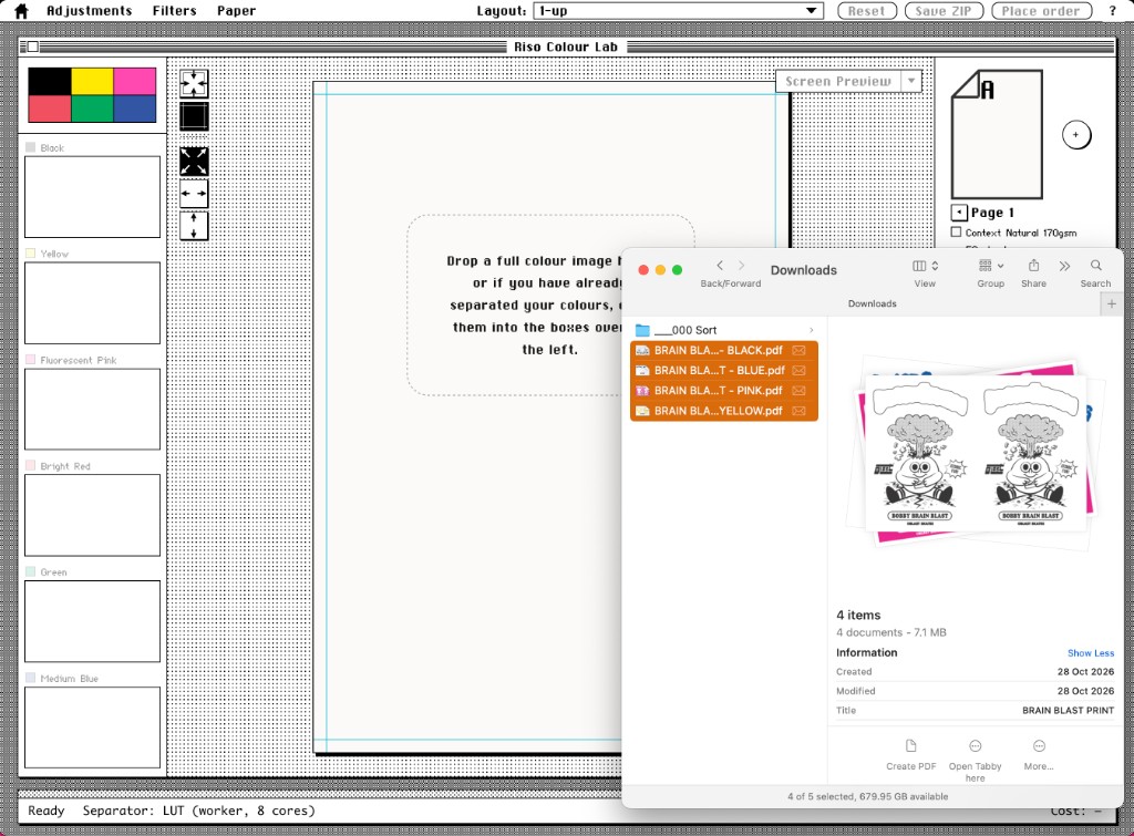
However, in some instances, if these layers are exported as the colours they're supposed to be, the chances are they might need to be darkened.
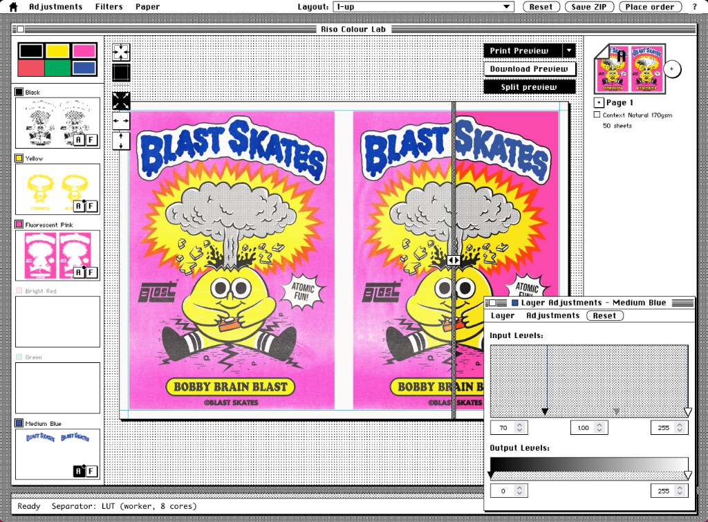
We'll use the trick we used before of opening up the adjustments, looking for the two peaks in the histograms, which are very extreme in the case of this graphic design one, and moving the dark and light points to match the spikes that we can see, making the pink, yellow and blue stronger in this design.
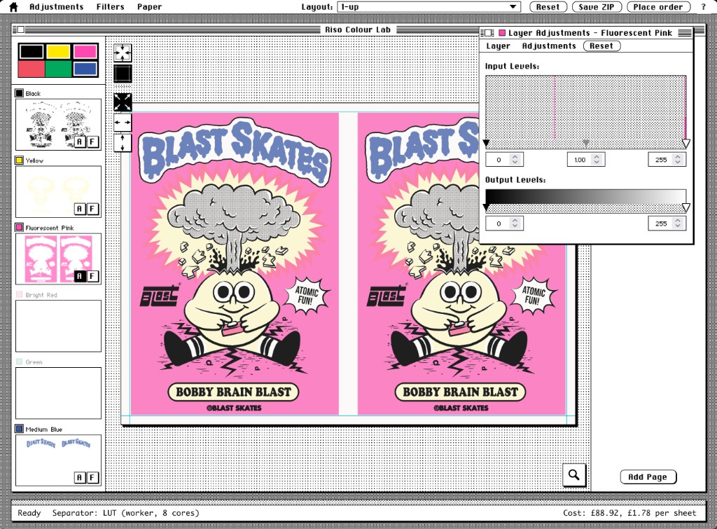
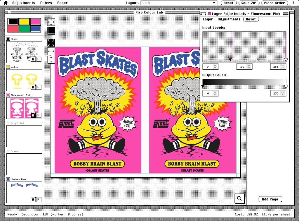
One of the reasons why this happens is yellow is quite a light colour and doing a straight conversion to greyscale will put it around the mid-greys, which will print lighter than you probably expect.
Experimenting with colour§
This is a local car park building taken against a blue sky. But I want to do something interesting by having the sky pink instead.
If I select the colours pink and black and drop the image in, and I'll get the result on the right, which isn't what we want.
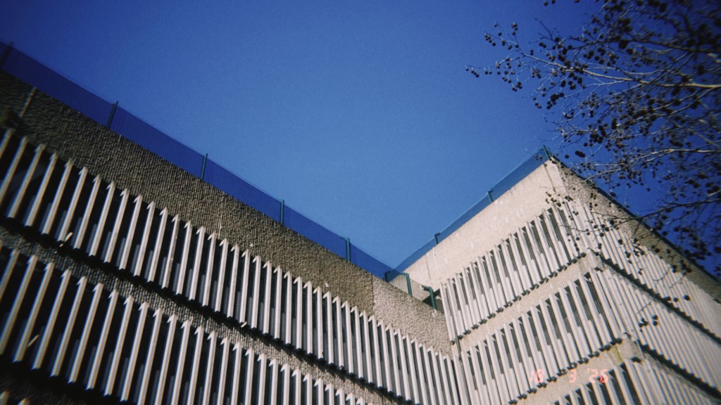
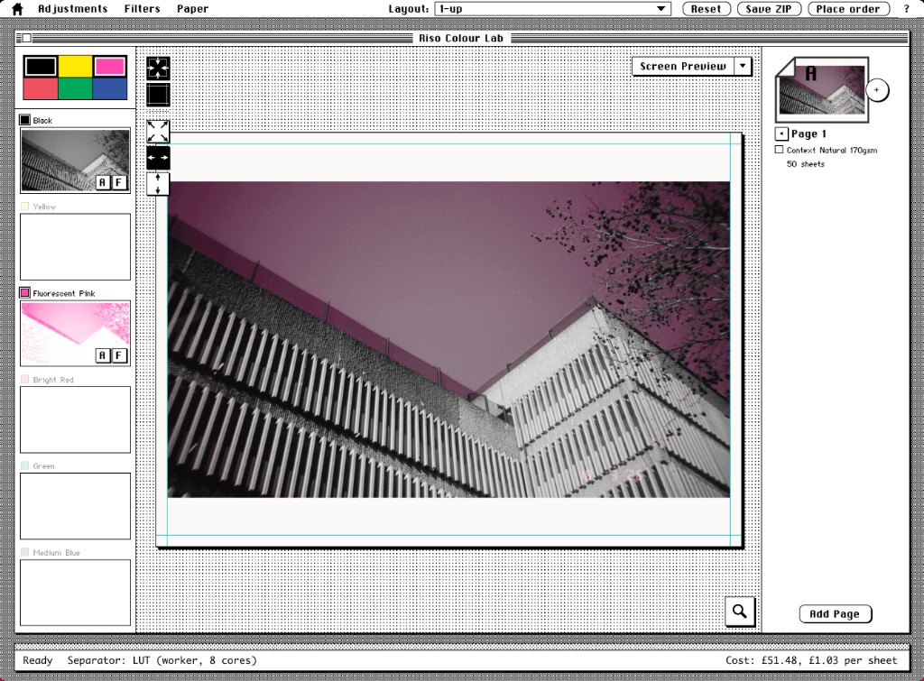
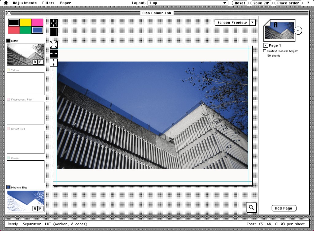
Instead, what I can do is select black and blue as the inks, which will generally separate the colours better, because the building ends up mainly black and the sky ends up mainly blue.
And then I can grab and drag the blue layer up to the pink layer.
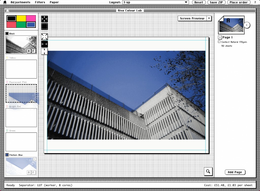
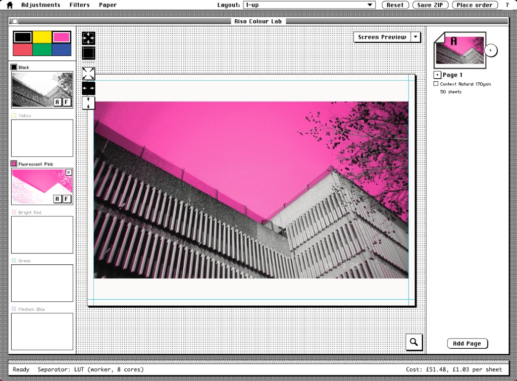
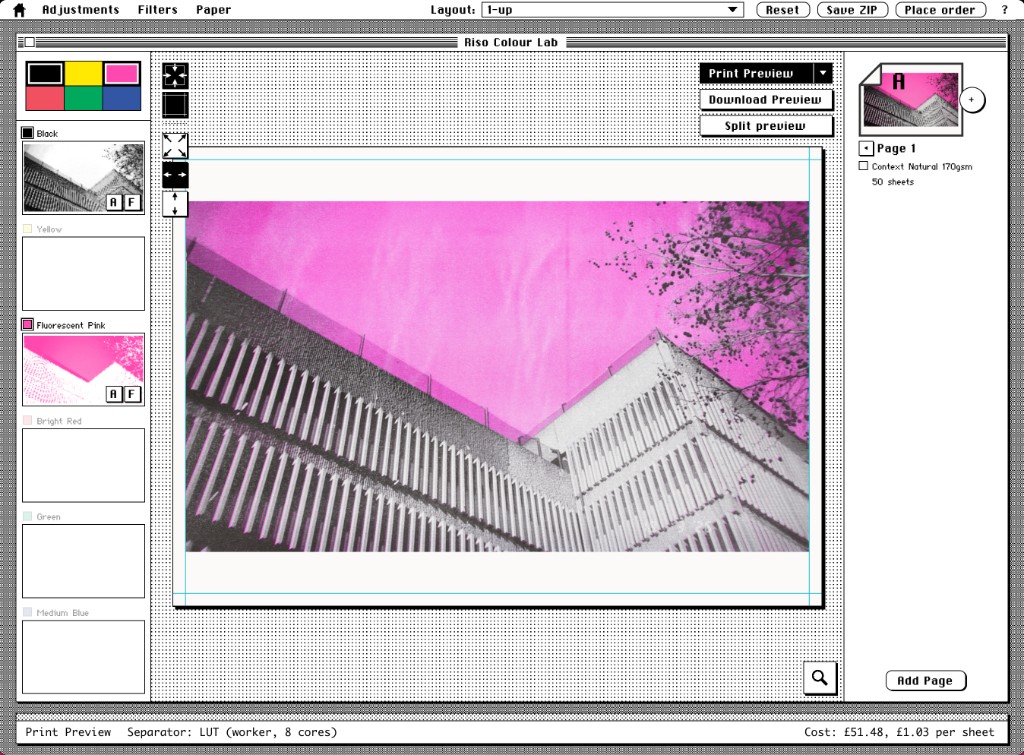
One of the things about Riso printing is sometimes it's fun to experiment with colours and swap them around and do unexpected things with them.
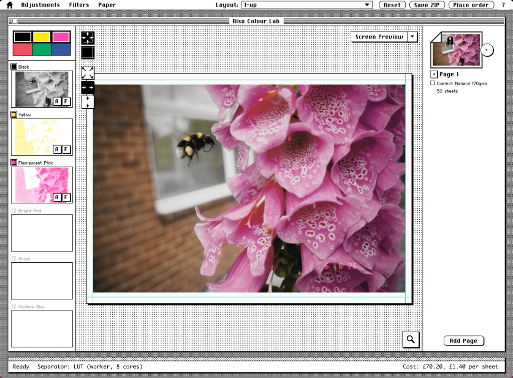
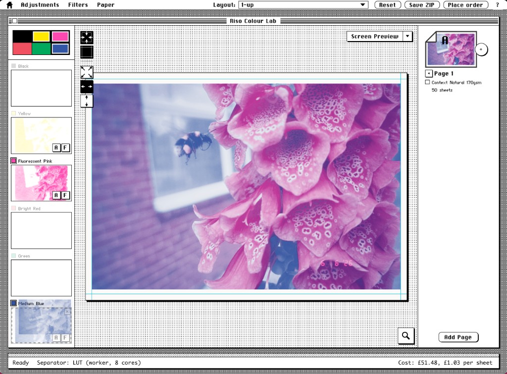
Here's a quick bee example, I want to have this photo printed as a fluorescent pink and blue duotone.
So I select those two colours and drop the photo in, and it looks like this.
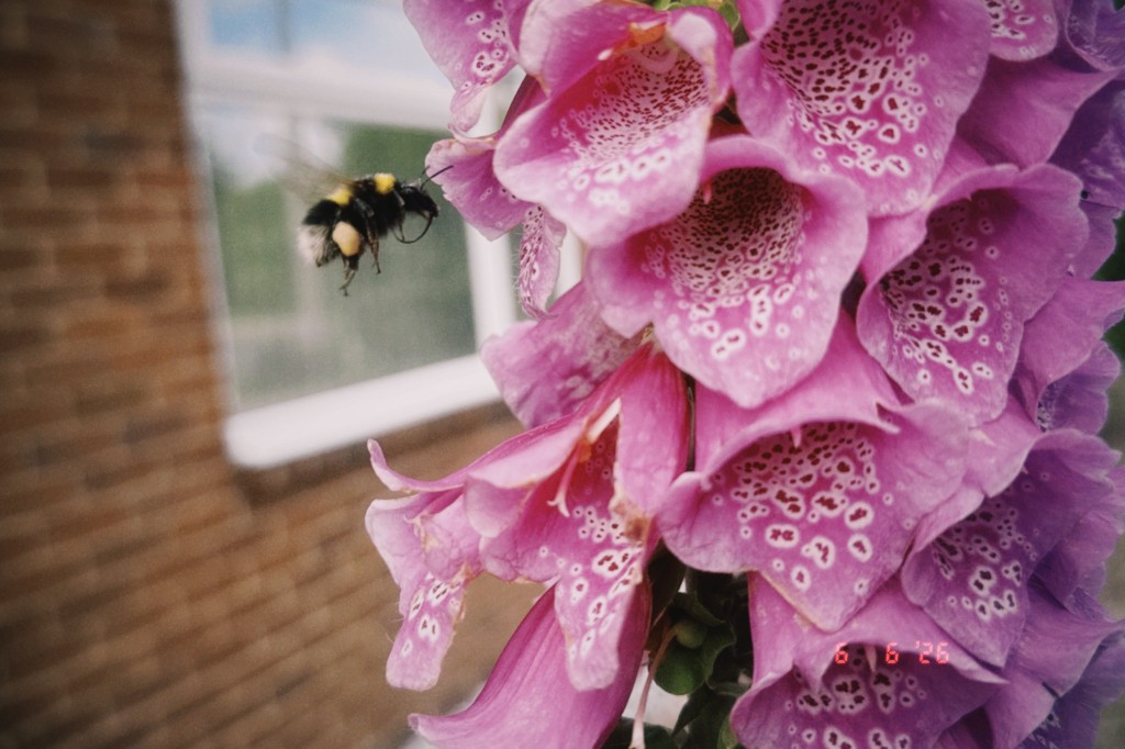
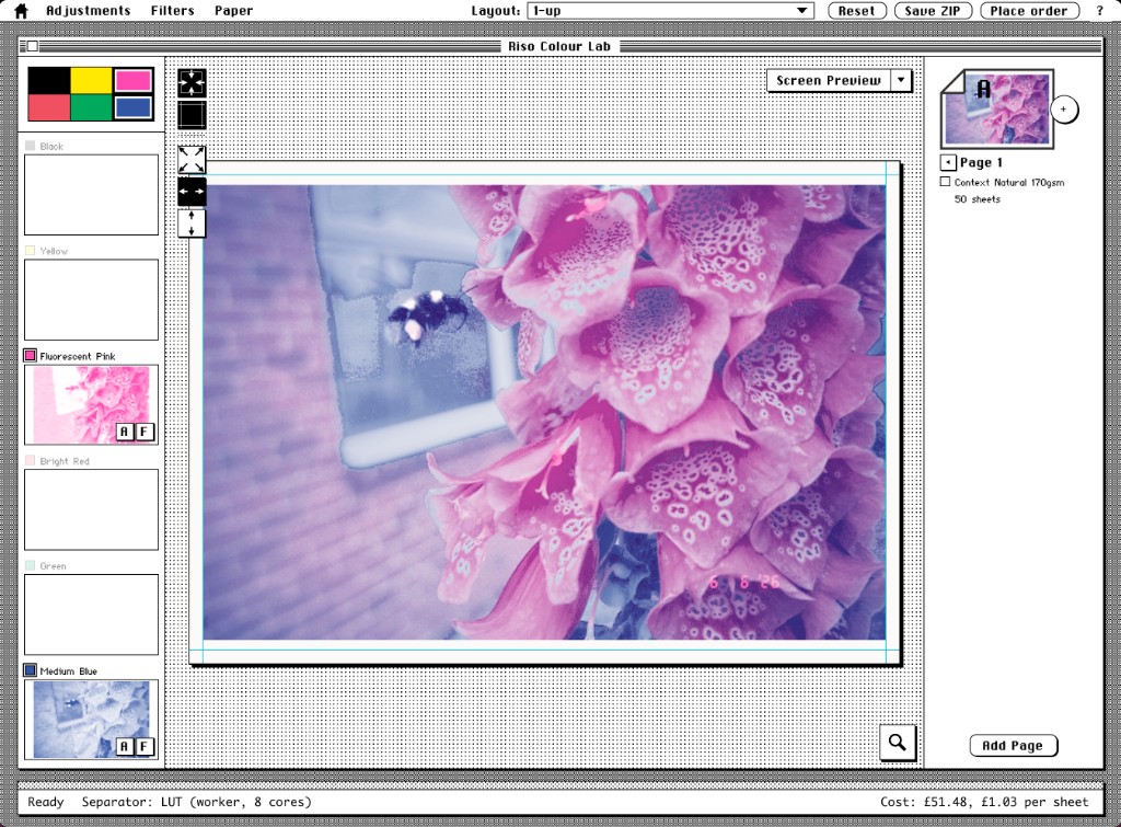
It's okay but there's a few artefacts, especially the reflections in the window.
But instead I can do this, which is to select black, yellow and pink, and wait for it to run the separation. I then turn the yellow layer off to discard it and drag the black layer down to the blue layer, and the results are already looking a bit smoother.
A note about photos§
JPEG photos can often look fine, until the colour separation runs, which uncovers the blocky JPEG encoding.
If you have any control over your source images with photography, try to shoot in raw and export as PNGs, or very high quality JPEGs if you can.
Otherwise you might have to try and disguise JPEG artefacts by choosing different colours and swapping them around, as shown above with the bee, or using the blur filter on certain layers, although that's a last resort.
Filters§
Some ways to work around having low resolution images, or to get a more zine type of effect, is to use filters.
We don't have very many filters, because at some point you're better off going to use a different software package.
But these can offer some quick, cool, interesting effects.
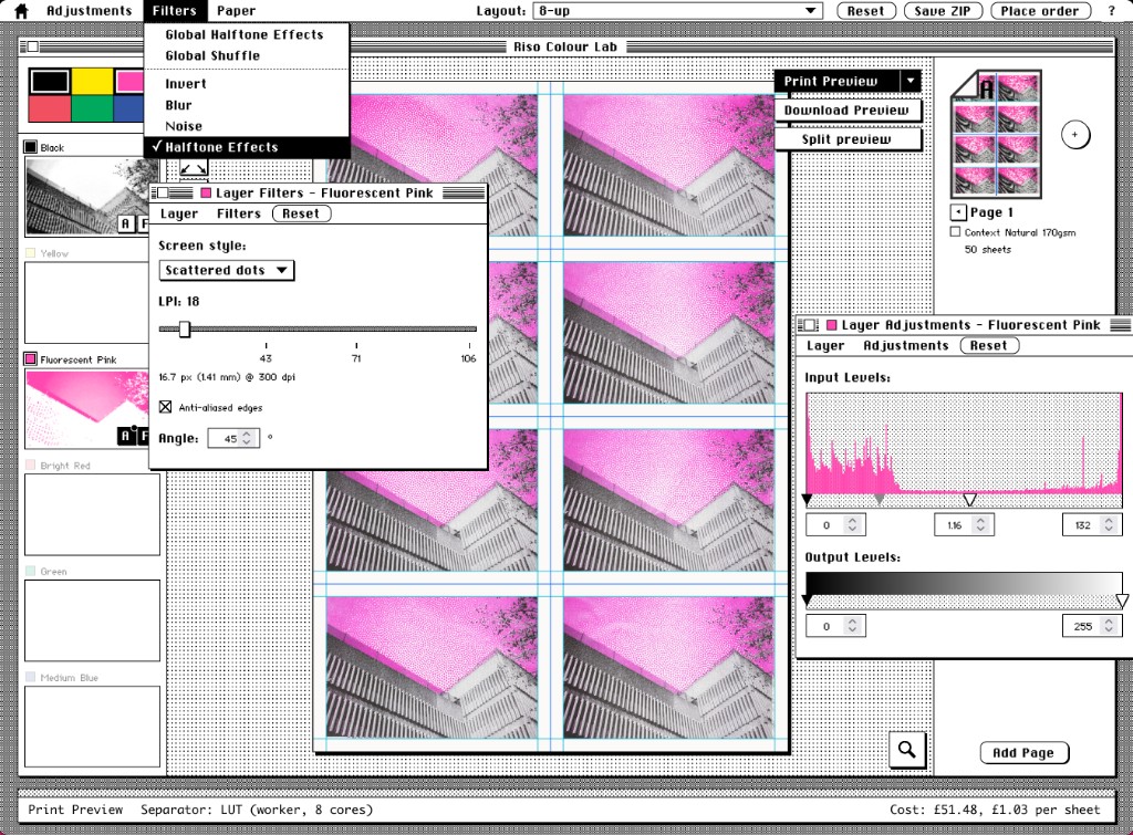
For example, I've been making some postcards from various places around Shrewsbury.
So here's the pink sky, and I've adjusted the levels a bit and applied a scattered dots halftone filter to the pink layer.

More§
You can find out even more about how we built the Colour Lab over here.