Resources / About the Colour Lab
Building our Riso Colour Lab
All the things we had to do, to make a pretty darn good riso tool
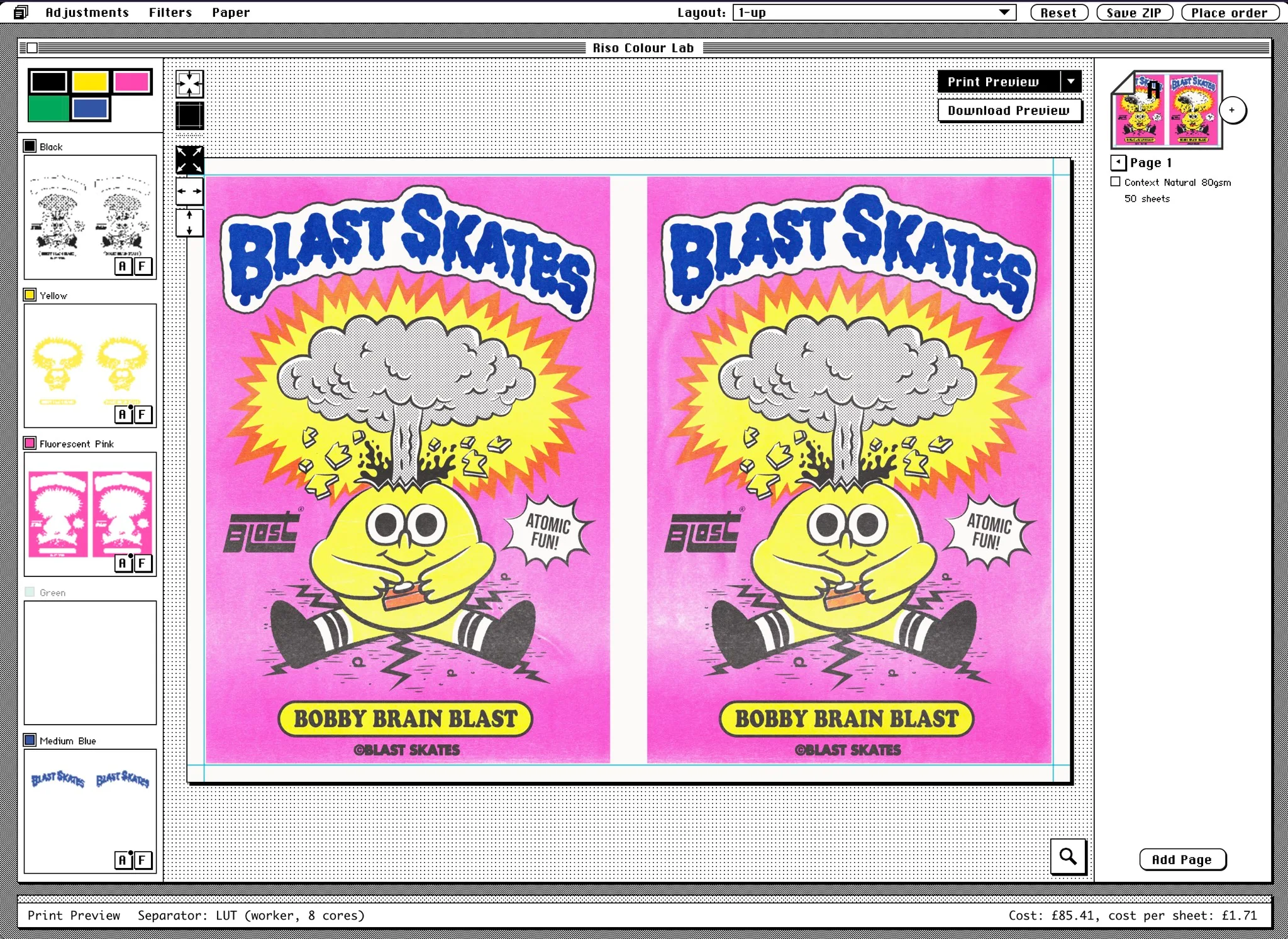
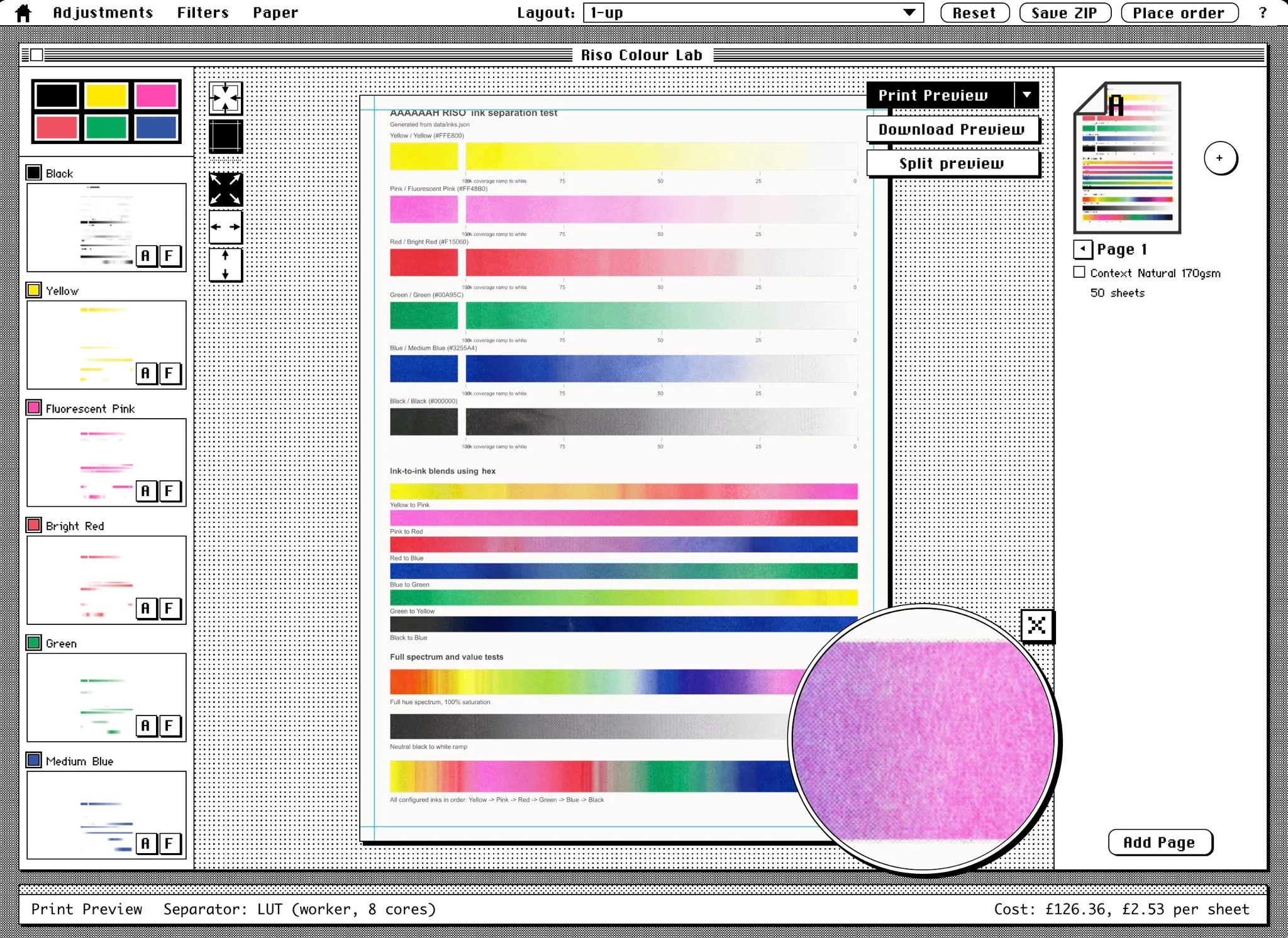
To kick things off, here's the web-app we've put onto our website...
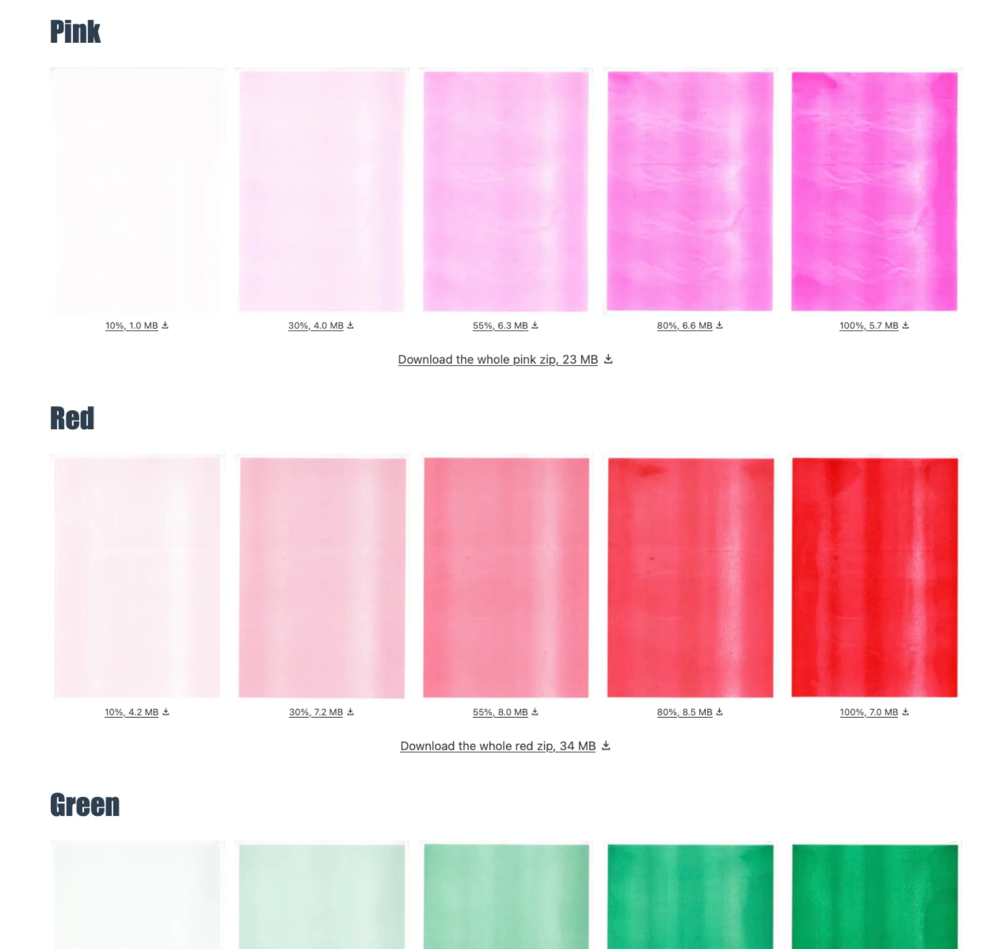
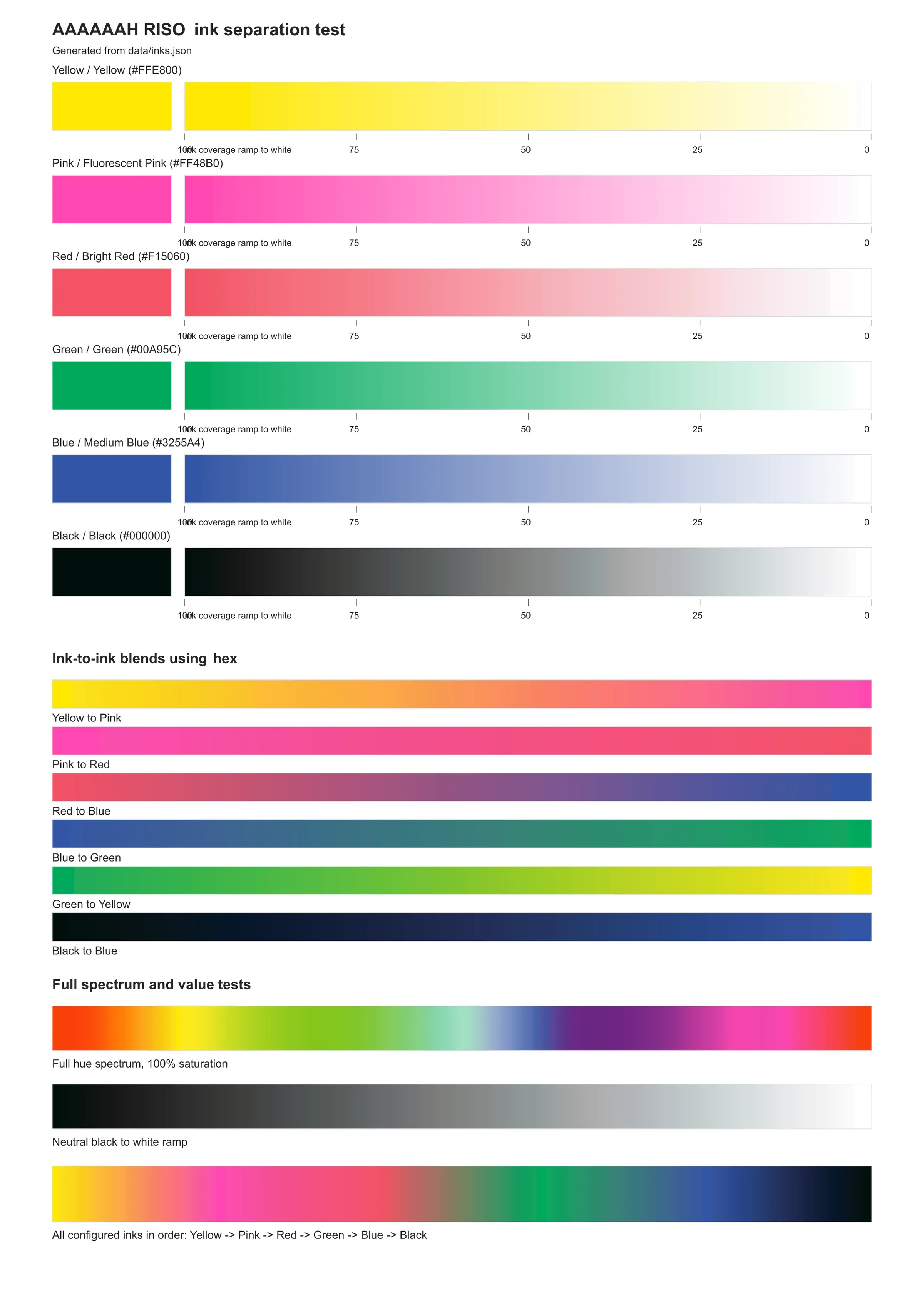
...and here's a whole page of Riso textures taken off our machine, that we needed to print to build the app, and figured people may find useful.
🌈 🌈 🌈 🌈 🌈
Setting the scene
In our just over a year of owning a Riso printer we've noticed two main pain points, which essentially boil down to the same thing.
The first is artists wanting to know how to prepare their artwork for Riso printing.
Most often artists have a final 'flattened' artwork that needs colour separating (we often suggest Spectrolite for doing that), or one with a loads of layers that need sorting into which ink colour they'll use. They also need to make sure the margins are right for our machine, and if they want to print 2-up, or 4-up there's some finagling there too.
Each Riso printing website we've seen has variations on a "how to colour separate your artwork" guide. The guides are great, the process isn't that complex, but it can be overwhelming the first time.
A quick example of someone wanting a solid yellow sun; to print solid yellow on the Riso machine the greyscale file the printer needs to make the stencil should be solid black, like the top row in the image below.
But if the artist does a straight conversion of their yellow layer to greyscale (which we've noticed most people do), solid yellow comes out as a mid-grey, which won't print the yellow how they want...
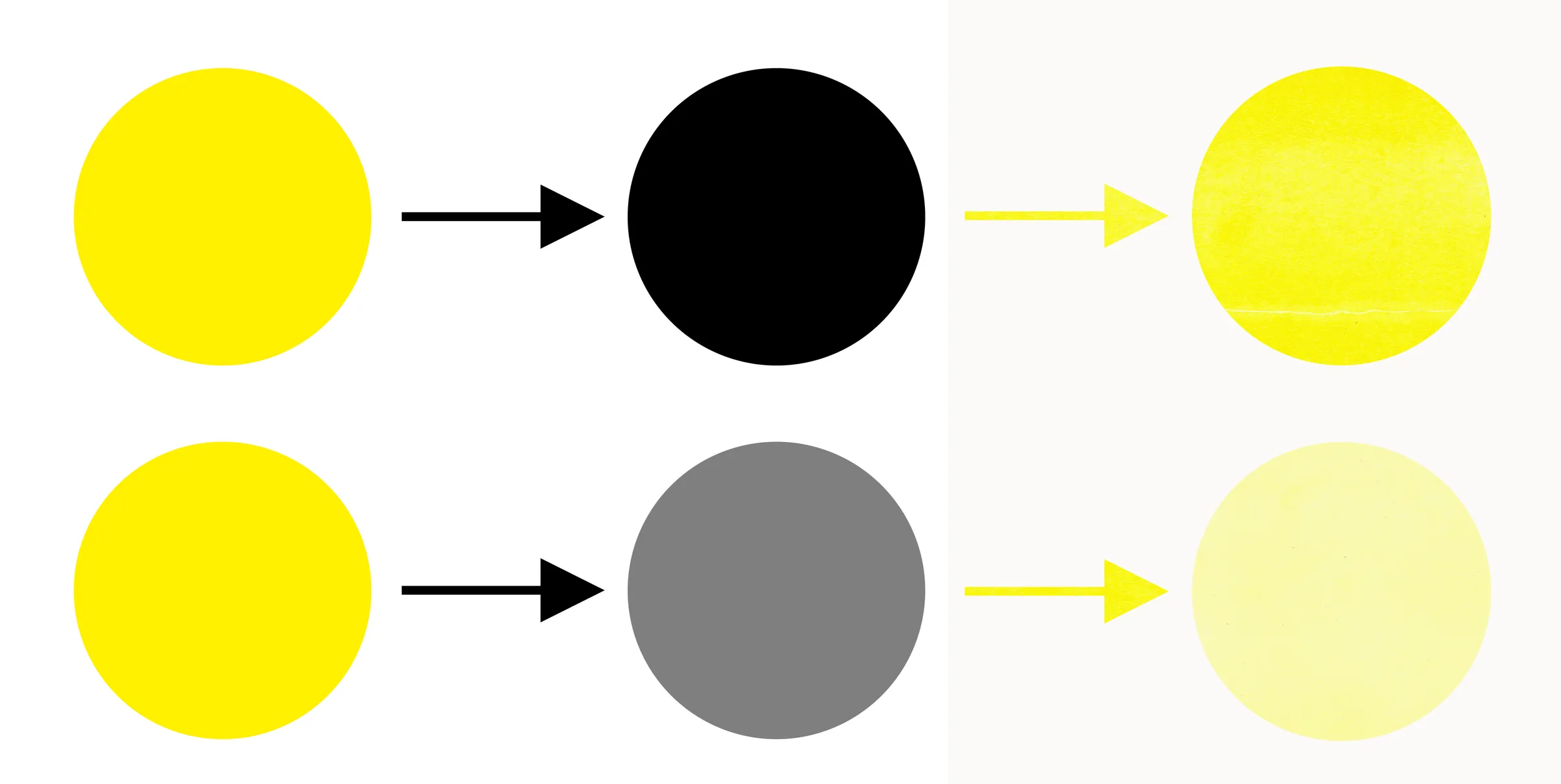
...so if an artist sends us greyscale images, we have to find out if they're the levels they actually want, or what they think they want.
It would be handy if they had a better idea of what would be printed before they committed to anything.
The second pain point is for us; the variety of file formats we get given. Perhaps we're given the final full-colour image as a .png, or a .pdf, and .psd. Or, as separate layers in a Photoshop files, or each colour as a separate file which may still be in colour or converted to greyscale (correctly, or not).
All at various sizes, dpi and with or without the margins. It's a lot.
So at the start of 2026 Dan set about building the "Colour Lab" with four main aims.
- Handle the colour separation
- Give a realistic print preview to set expectations
- Allow simple adjustments to the lightness/darkness of each colour
- Bundle the results up in a consistent set of files ready for print
Let's start with the more interesting one...
🌈 🌈 🌈 🌈 🌈
Give a realistic print preview to set expectations
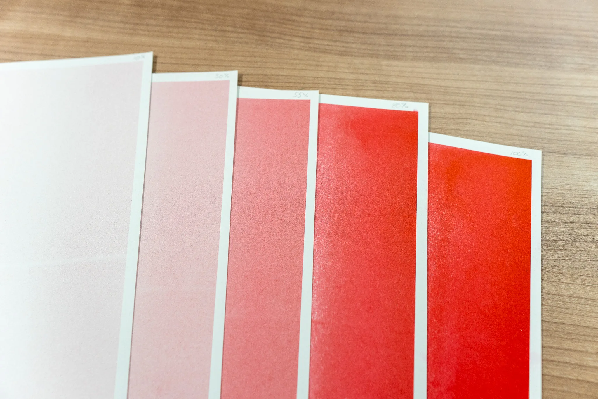
If we're going to make realistic previews, we need realistic textures, and it felt like the best way to get those was to print out each of our colours; black, fluorescent pink, red, medium blue, yellow and green.
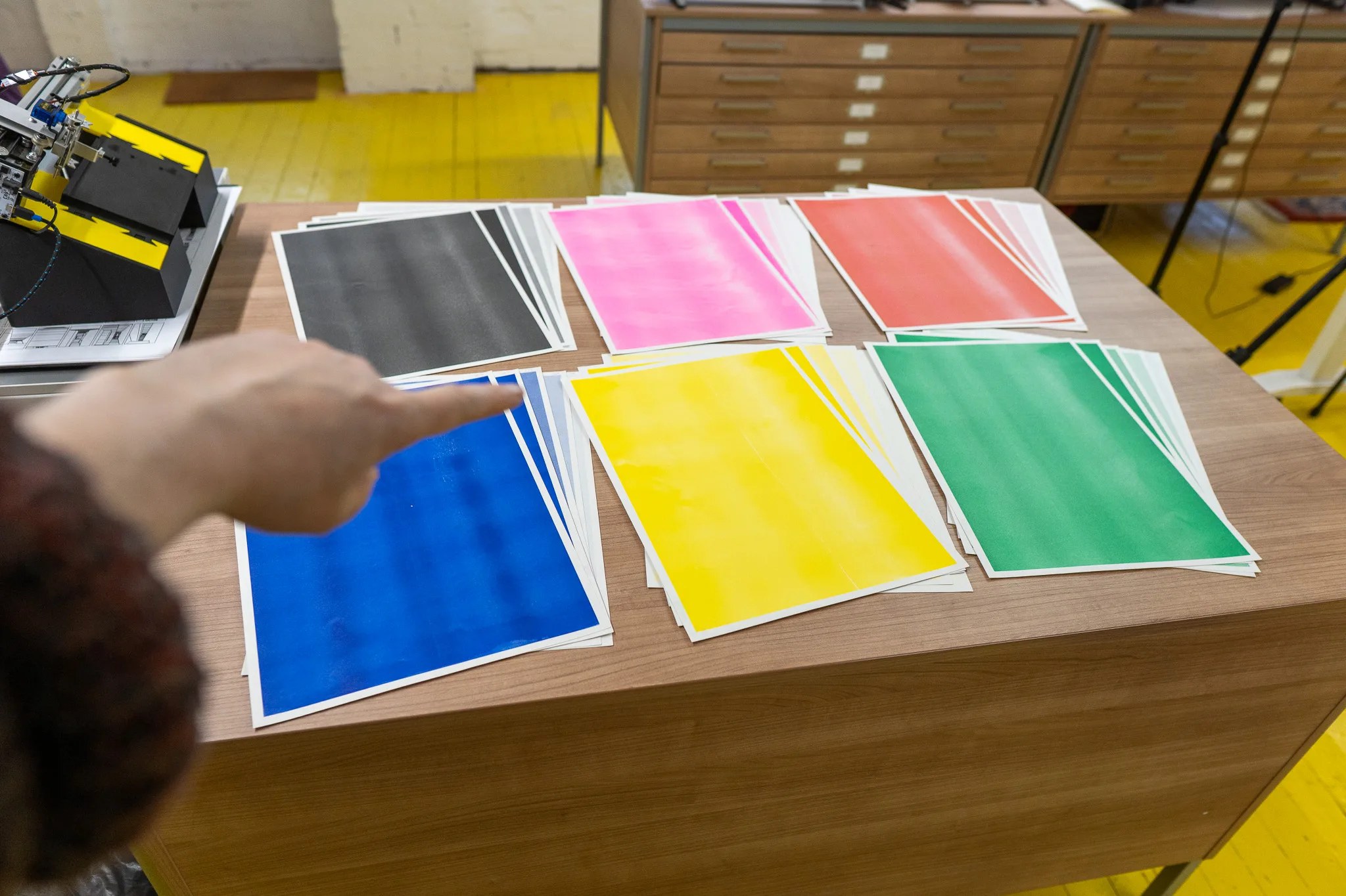
Each print was was done by sending a solid grey/black rectangle at five opacity values; 10%, 30%, 55%, 80% and 100% (for various mathematical reasons), to be printed in each colour.
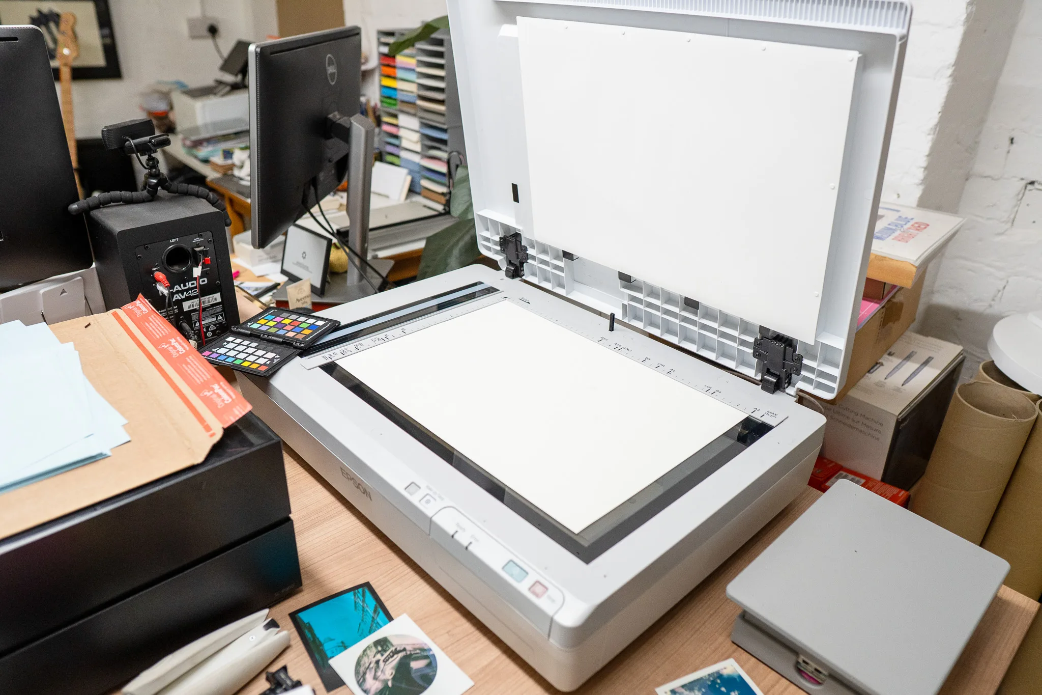
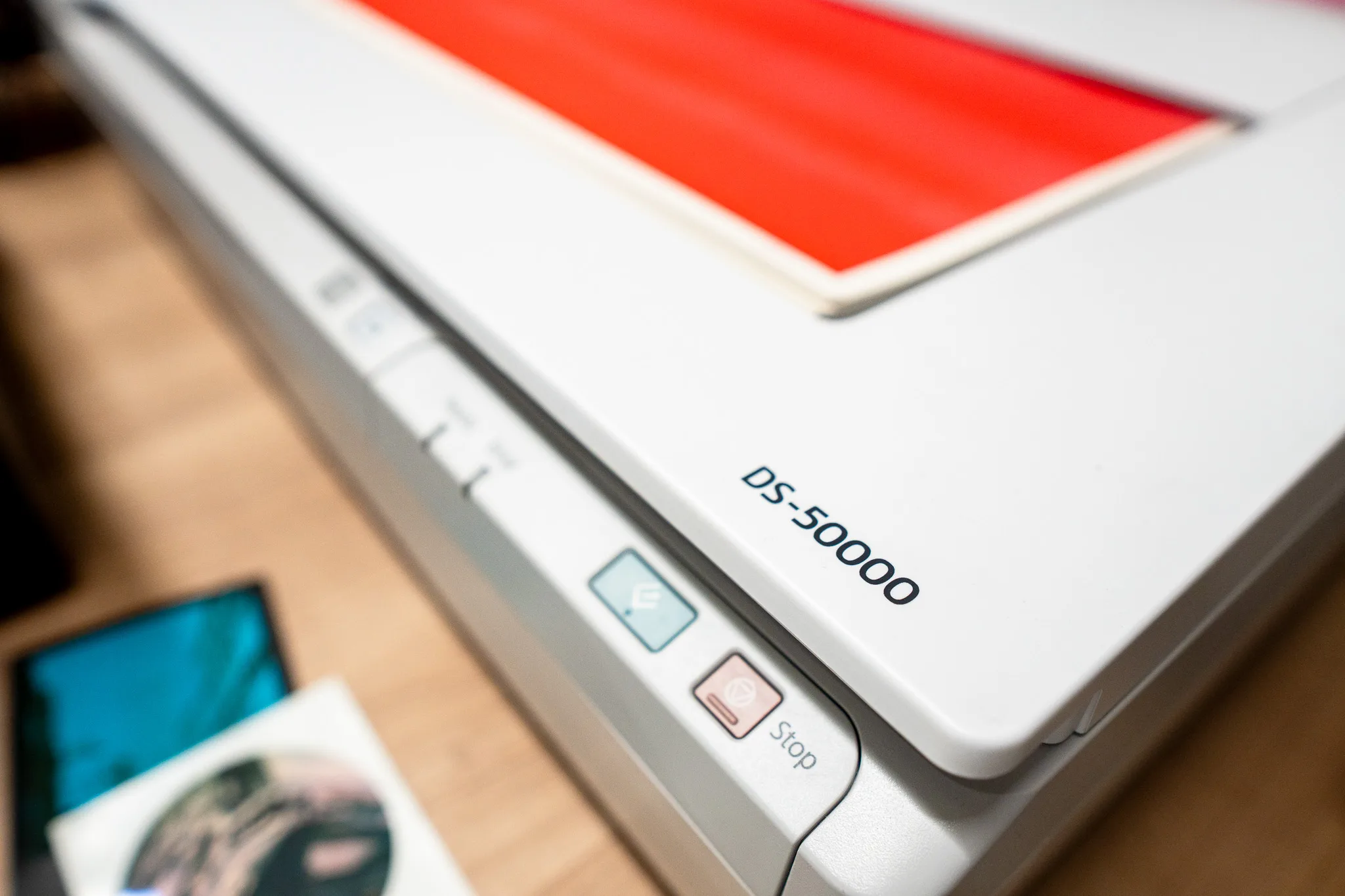
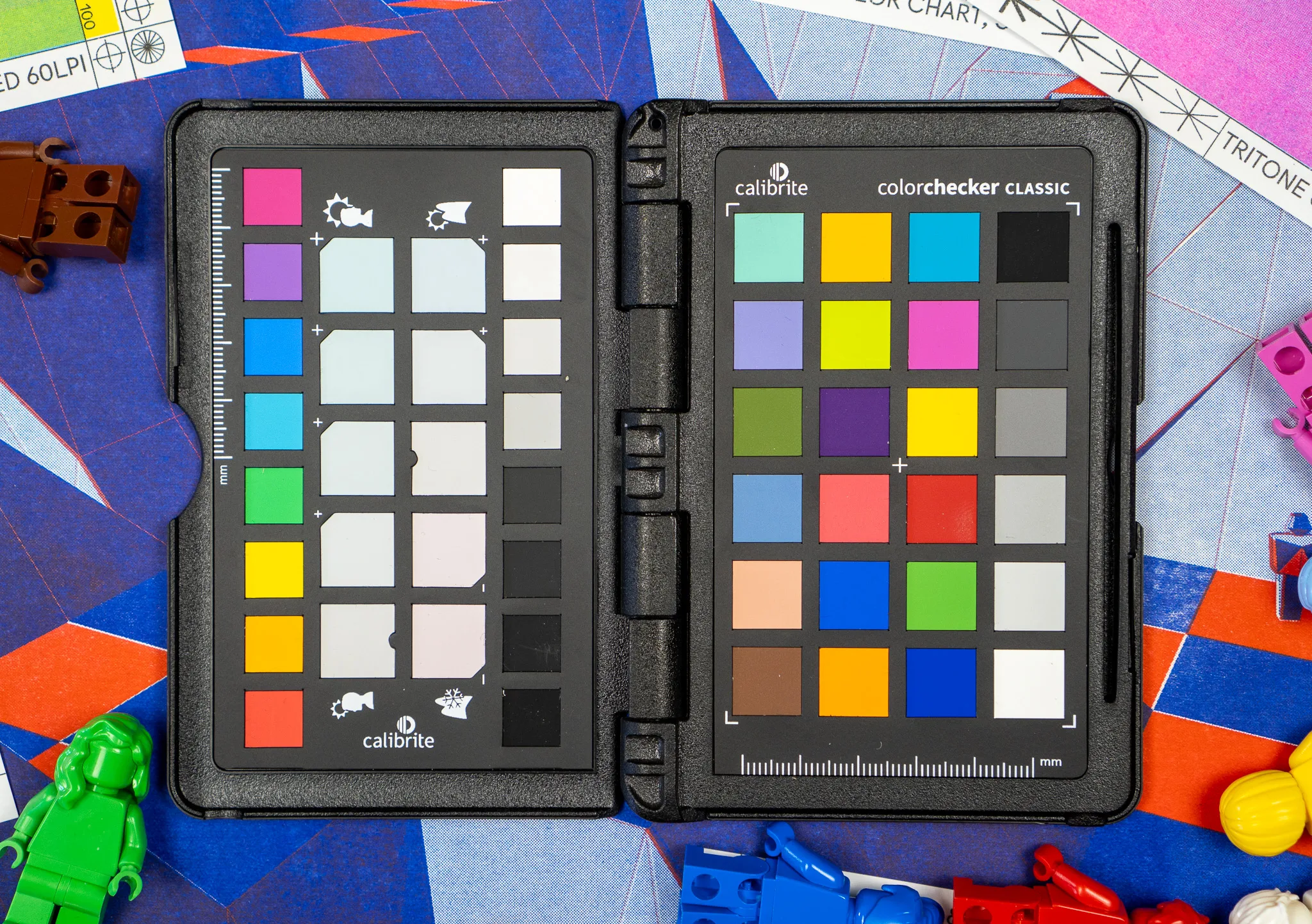
The next step - now having 30 prints - was to scan them in on our Epson DS-50000 A3 document scanner. It's not quite as good as a designed-for-art scanner, but we've used a Calibrite ColorChecker to make sure the colour in the scans are as true as possible.
Of course - and I'll say this again several times - It's impossible to properly display inks like Riso's Fluorescent Pink, the brightness of the yellow, the richness of the red. It can't properly be photographed, scanned or displayed on screen.
So we're just doing the best we can, and ultimately the previews on screen will be duller than the final actual print. At least until I figure out HDR, but that's not going to happen for a while.
Here's a closer version of our Bright Red printed at 55% opacity, in screen mode 106 lpi.
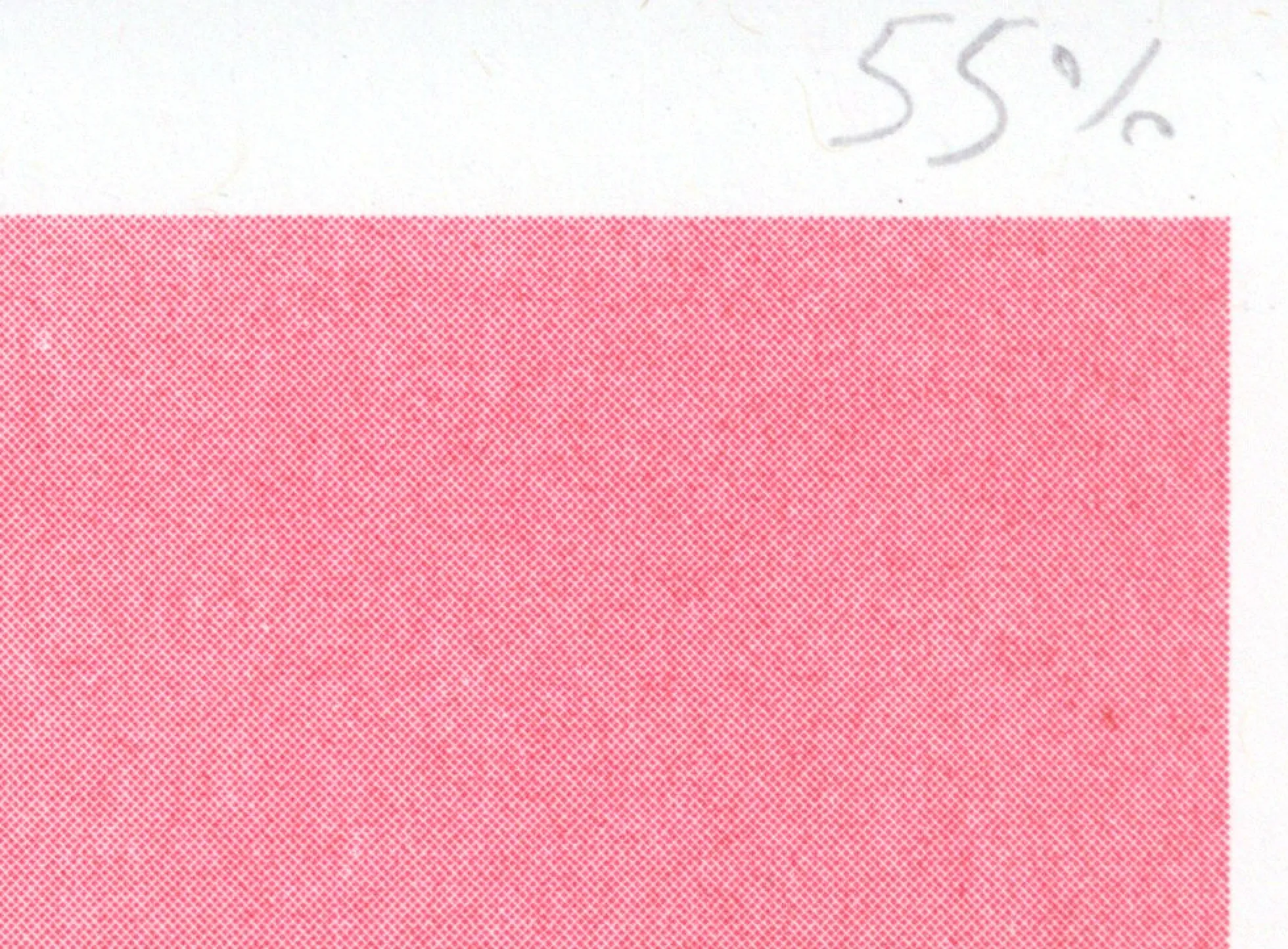
Now, the trick is this, when the artist selects "Print Preview" the Colour Lab converts each colour into the greyscale stencil we'd actually print from, sends them to the server - which holds the high resolution 600dpi texture scans - gets the grey value of each pixel in turn, and grabs the corresponding pixel(s) from the textures.
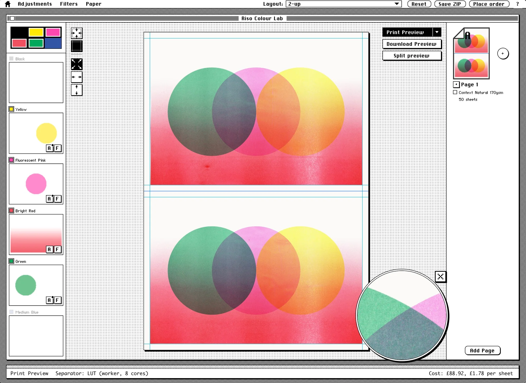
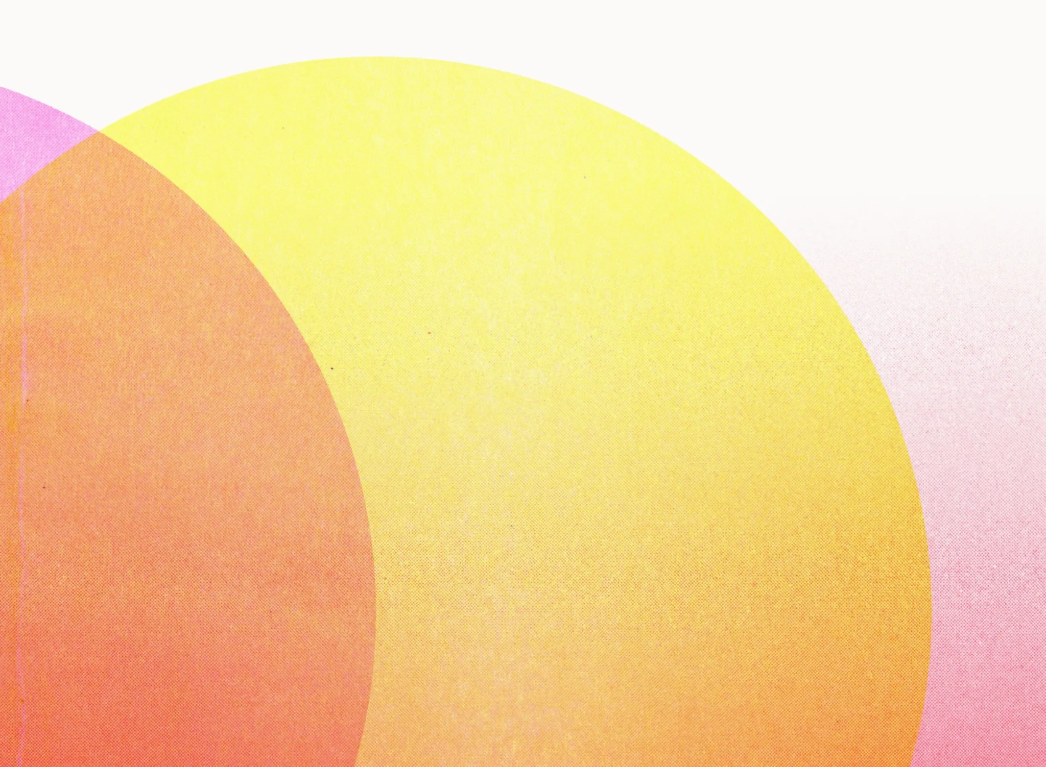
So if a pixel from the red layer is 70% grey, it'll grab the colour from both the 55% and 80% red texture layers and pick a mid-point between the two. Here's a closer view of the red gradient over the top of the yellow and pink. Proper, real, riso textures.
And by doing that for every single pixel for each colour, and then making a final composite of all the layers we get our final preview image, of what it could look like.
Or at least something closer to the final print than the normal "screen" preview you'd get.
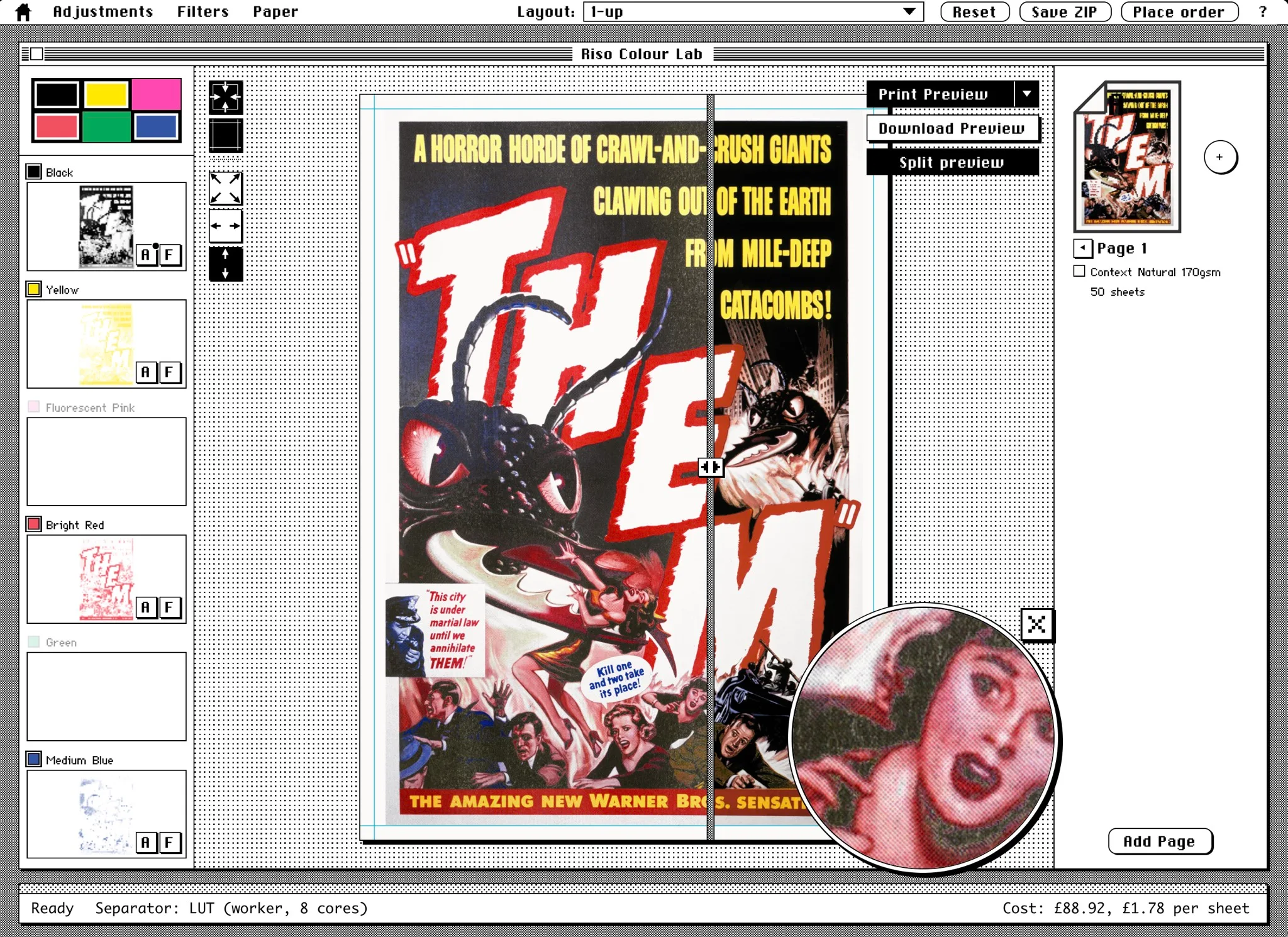
Then of course you can start experimenting by rearranging the layers; like moving the yellow layer to the green layer, red to the yellow, throwing the blue away, and dragging the black to the blue. Or throwing the source image into the black layer and a couple of gradients into other colours.
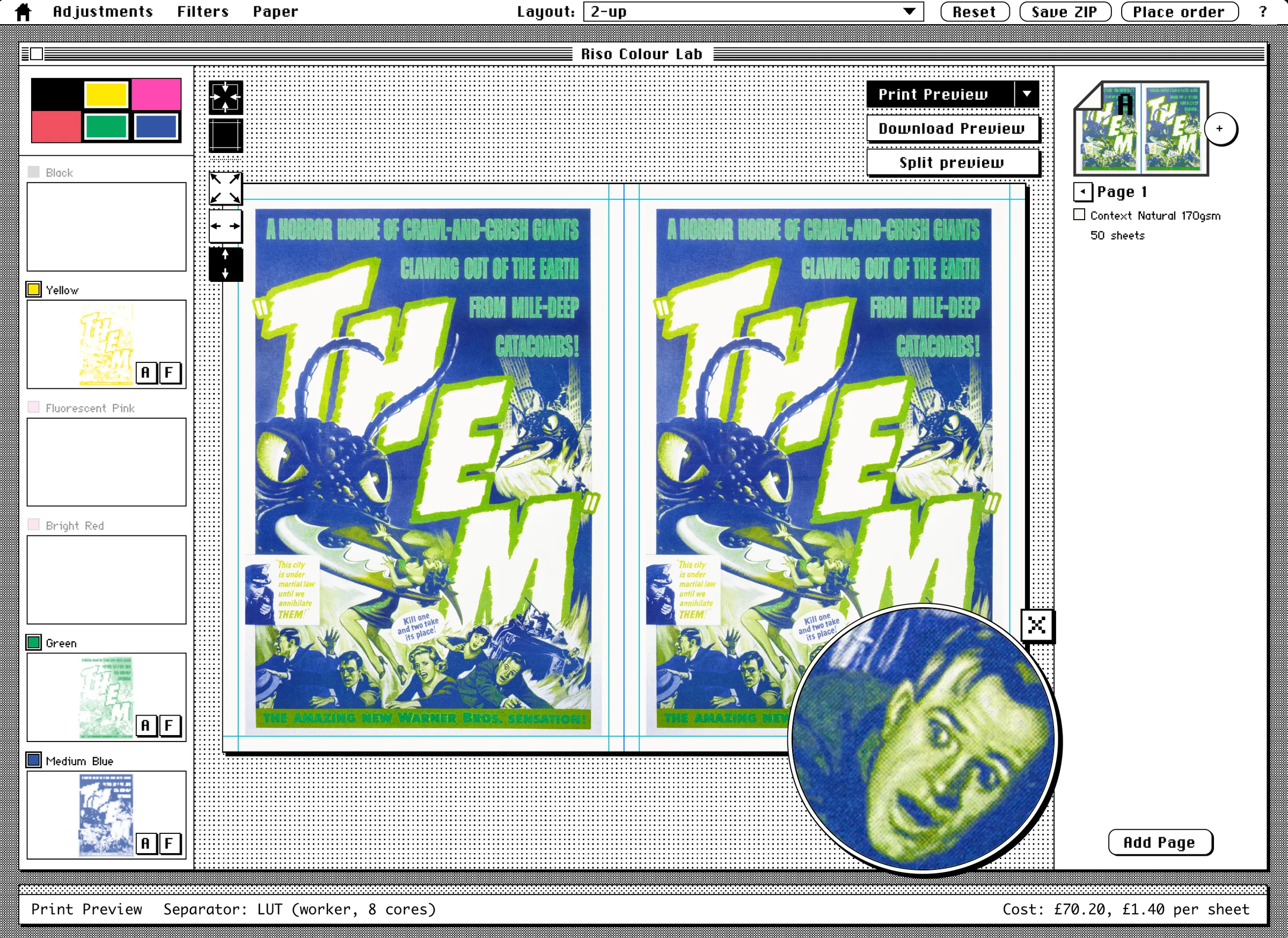
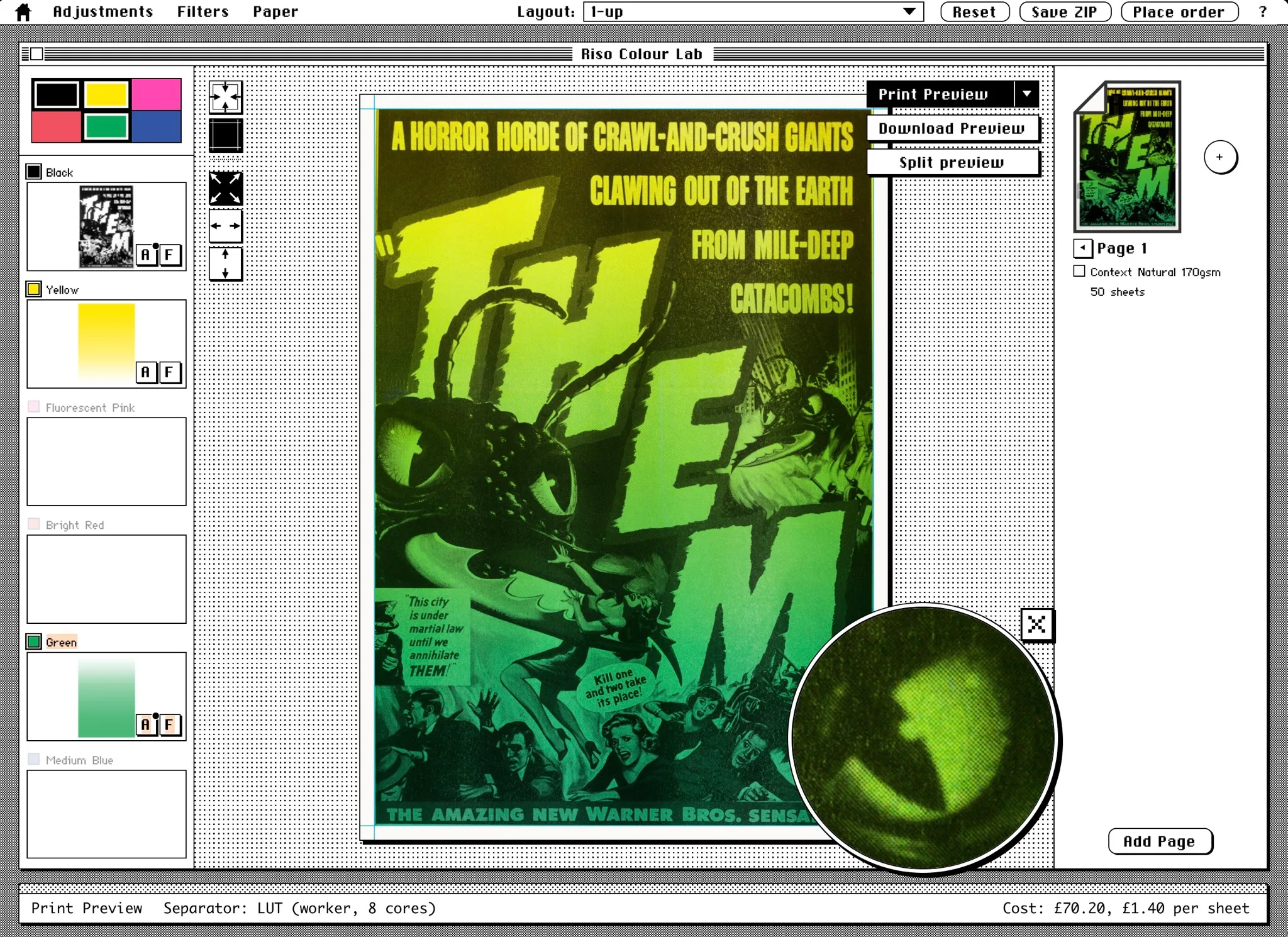
A lot of the fun of riso is trying to make something look as "correct" as possible, and then totally screwing around with the colours/drums.
It isn't perfect, obviously!
To create the textures I've printed full rectangles of colour. However full blocks of colour print differently to small spot areas; there'll be flooding, smudging and lighter spots that you may otherwise not get.
For example our 100% black texture prints out like this...
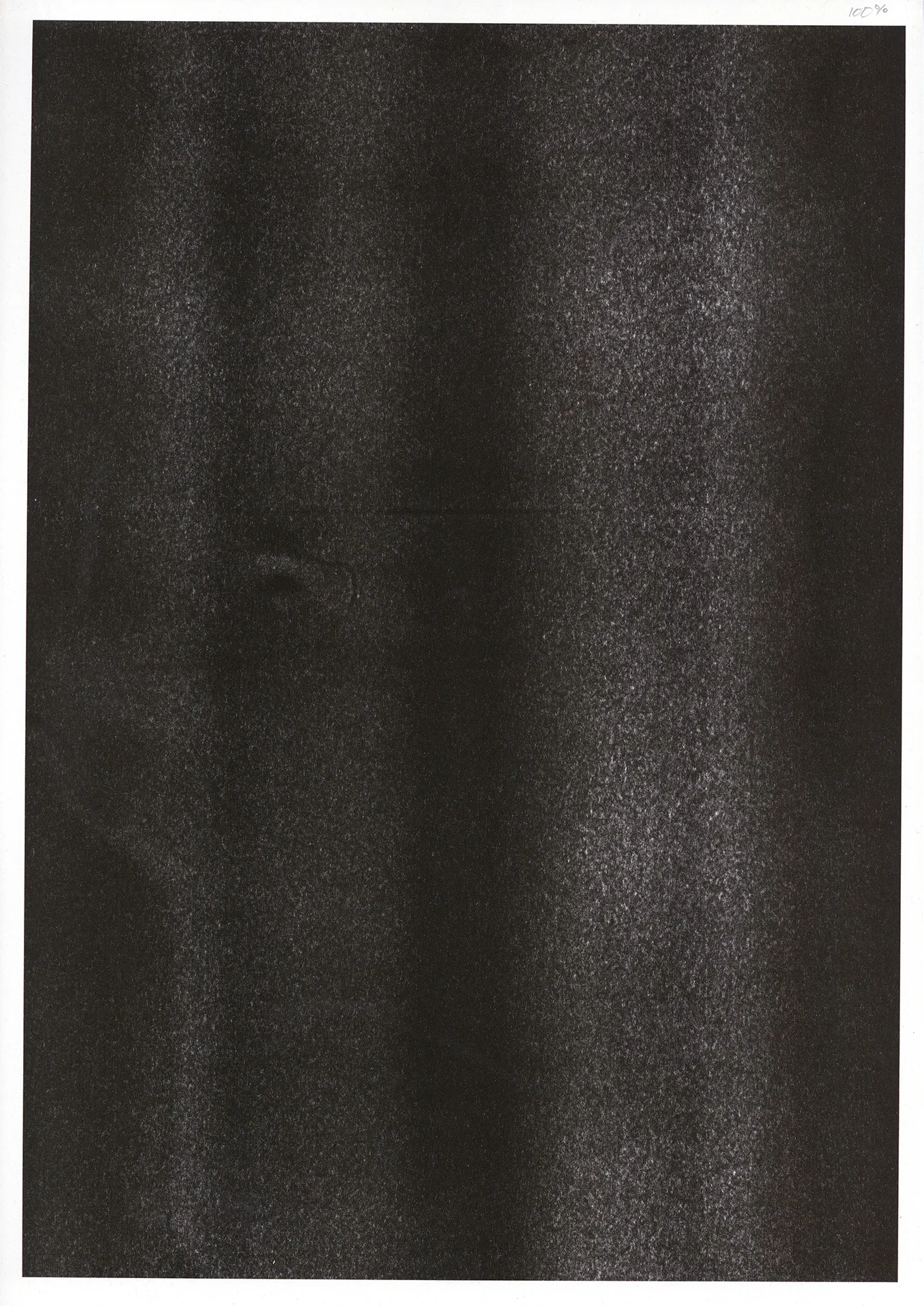
...but when I'm doing solid text, or smaller areas the black comes out a lot blacker.
And again, the fluorescent pink comes through on the preview as darker, duller and a bit more purple, because you can't capture the brightness & tone of the fluorescent ink.
Going back to the @blaskskates print example you can see the difference between the print preview (left) and what you'd normally see with a typical "riso" blend preview on screen (right).
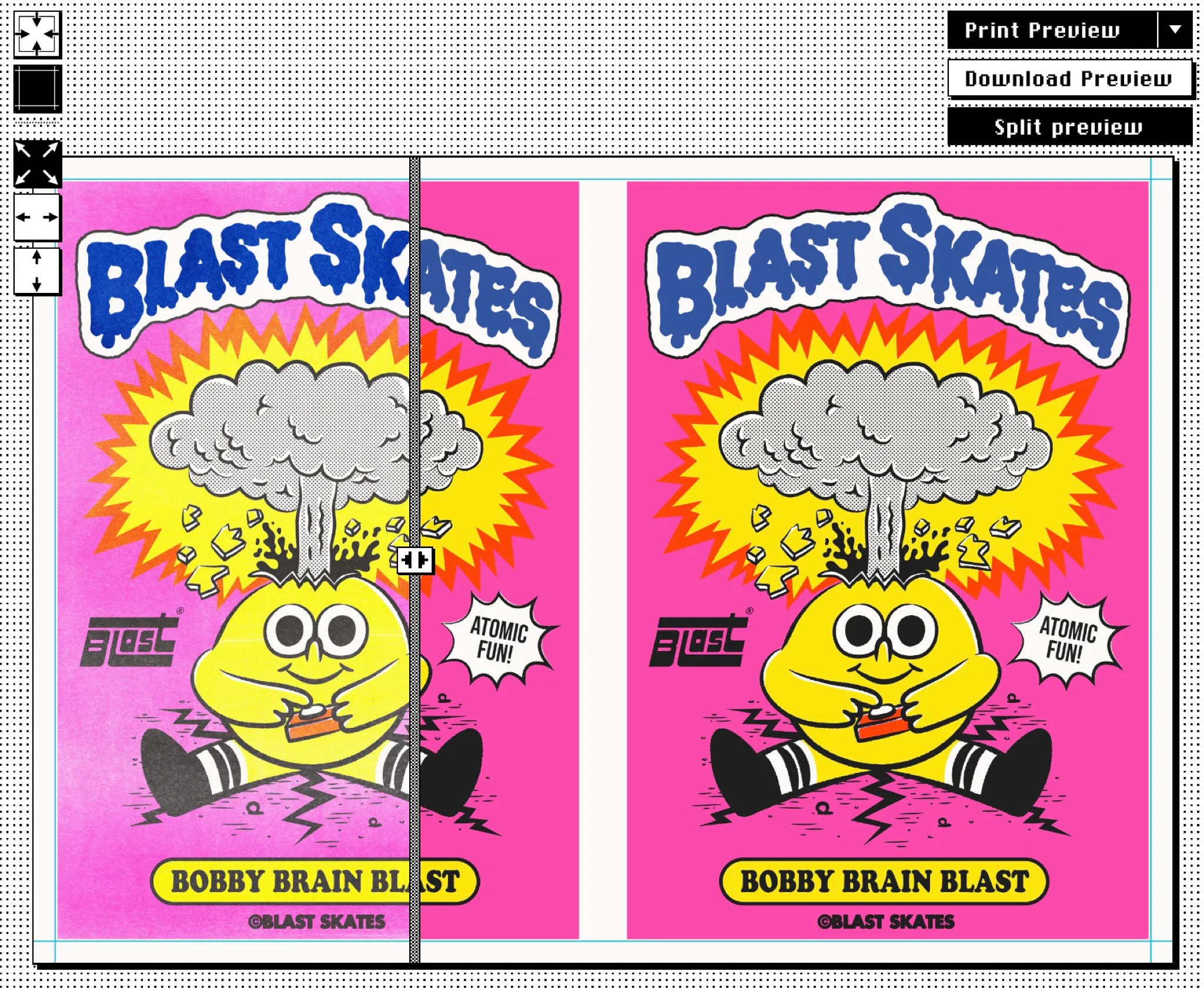
Again, it's not only about helping the artist, but also setting expectations.
If Blastskates was expecting the print to come out like the source image over on the right, there's room for disappointment; but because they had a chance to preview a more accurate view of what it'd look like; with textures of the very Riso machine it was getting printed on, we figured they'd have passed the vibe-check before ordering and the chances of everyone being happier would be better 😁
Best of all, the artist could hit the "Download preview" button if they just wanted to keep the riso-ified version of their design, or click the "Save ZIP" button which would get them all the files.
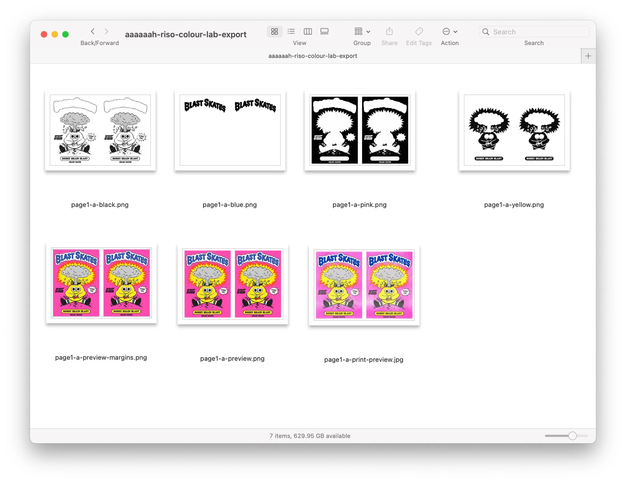
But even better, if they go ahead and "Place order", we get all the files we need to fulfil the print job uploaded to a print queue on the server; all named correctly, all in the right size and format, along with the original image(s) and the print-preview so we know what we're aiming for.
This alone is so useful that when we're asked by an artist to handle the whole process and they want to be 'hands-off', we use the Colour Lab ourselves to prepare the files, and it ends up in the same print queue.
🌈 🌈 🌈 🌈 🌈
Separating the colours
The other slightly more complicated part is the colour separation, which is far more nerdy and we'll save you from most of the details. It's fair to say that Dan went into colour space theory, colour separation, LUTS and reading academic papers on colour separation far more than he'd planned when started all of this.
What we wanted was a system that an artist could drop an image into and get a pretty good colour separation out, using just the ink colours we have in the studio (as of writing our Red drum is busy playing up).
It turned out there were several rabbit holes than Dan went down, here's a couple.
If you have a photo of an orange, but the only ink colours you want to use are green and black, no matter how hard you combine those colours together you can't get orange. Most solutions to splitting an image into two colours is to simply pick the best two colours to use 😁 but with Riso you can't just pick any old colours, you can only pick what the studio has.
So, step one, limit the system to only use the colours we have.
The second was dealing with black text, here's a poster we printed, which has a solid black title.
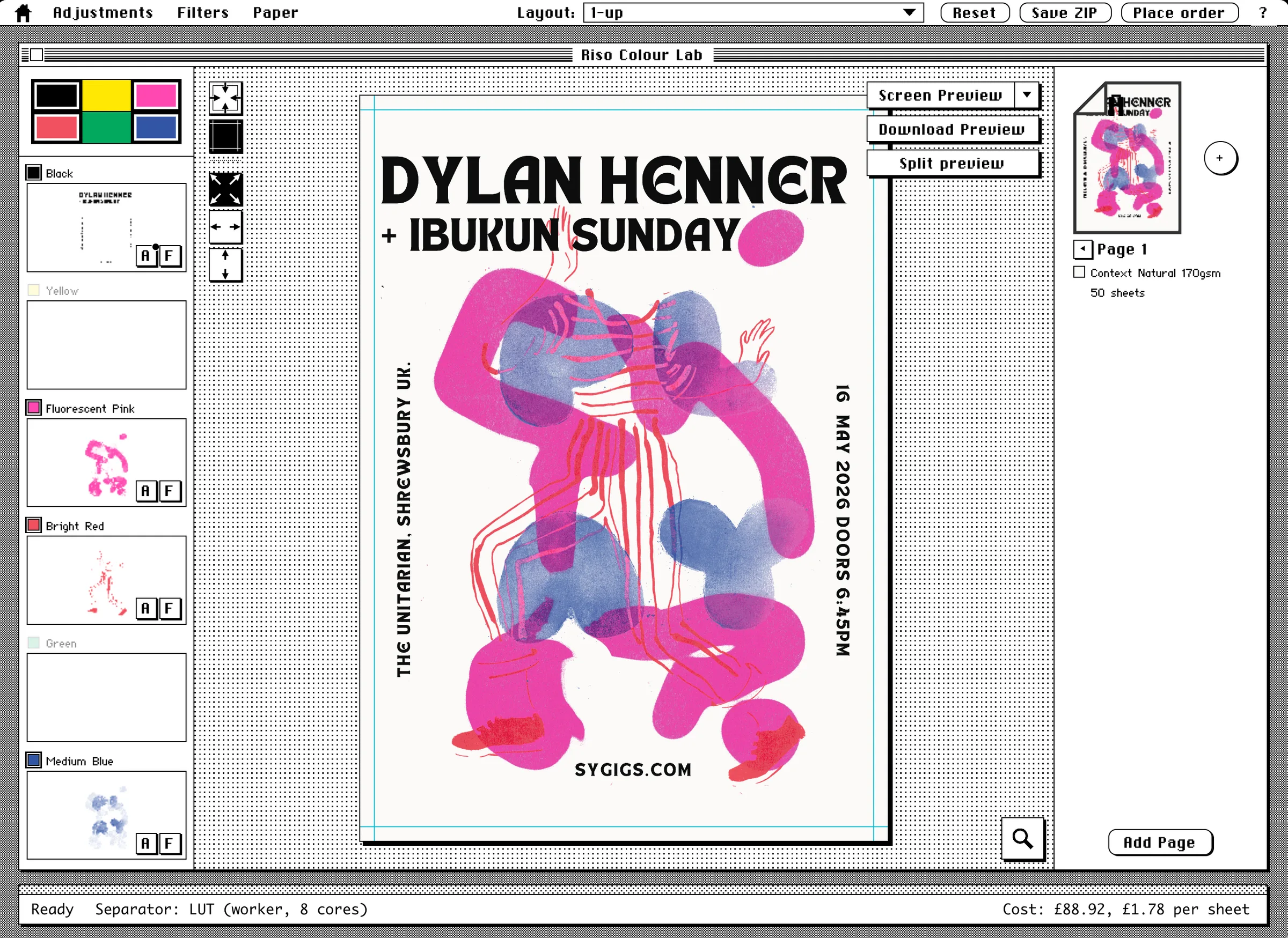
In earlier versions of the colour separator it'd make black by mixing all the colours together. What's blacker than black? Black + Red + Blue apparently.
And even when Dan solved one part, we ended up with a "halo" of colour around the black text. Fixing the Black = Black problem was cool, but it just shifted the problem the edge of the text, where mid-greys could pull in some colour from the other layers.
Which is why - when preparing files for the riso printer as a pdf - it's often recommended that the design is converted to an image, but the text is kept as text or vectors, to give it crisper edges.
But in this case we didn't have any of that, we only had the final flattened image to work with, with the text baked in. And honestly that's how most of out print jobs have arrived so far; local artists finding out we have a Riso machine, and going through their older images to find things to print. A few are now thinking in layers ❤️
Anyway, all that aside this is what we ended up doing.
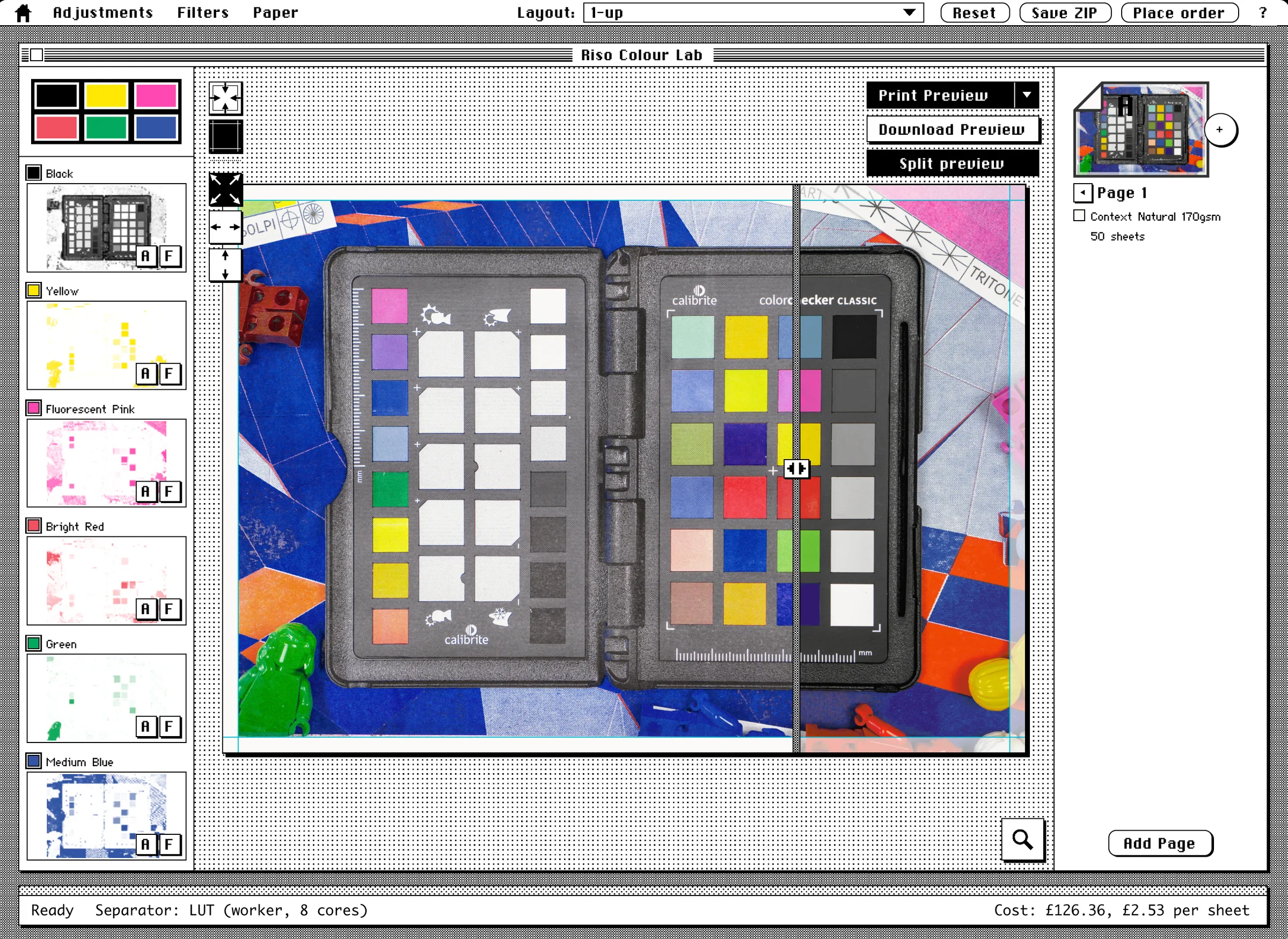
We took a "known" image, in this case this colour chart. Dan used code to create this which means he knows what the value of each pixel is at each point.
The next step was to - one pixel at a time - combine all the possible colour combinations to find the best match for the colour we were trying to hit, a brute-force number-crunching exercise that takes a couple of hours to run, and looks something like this...
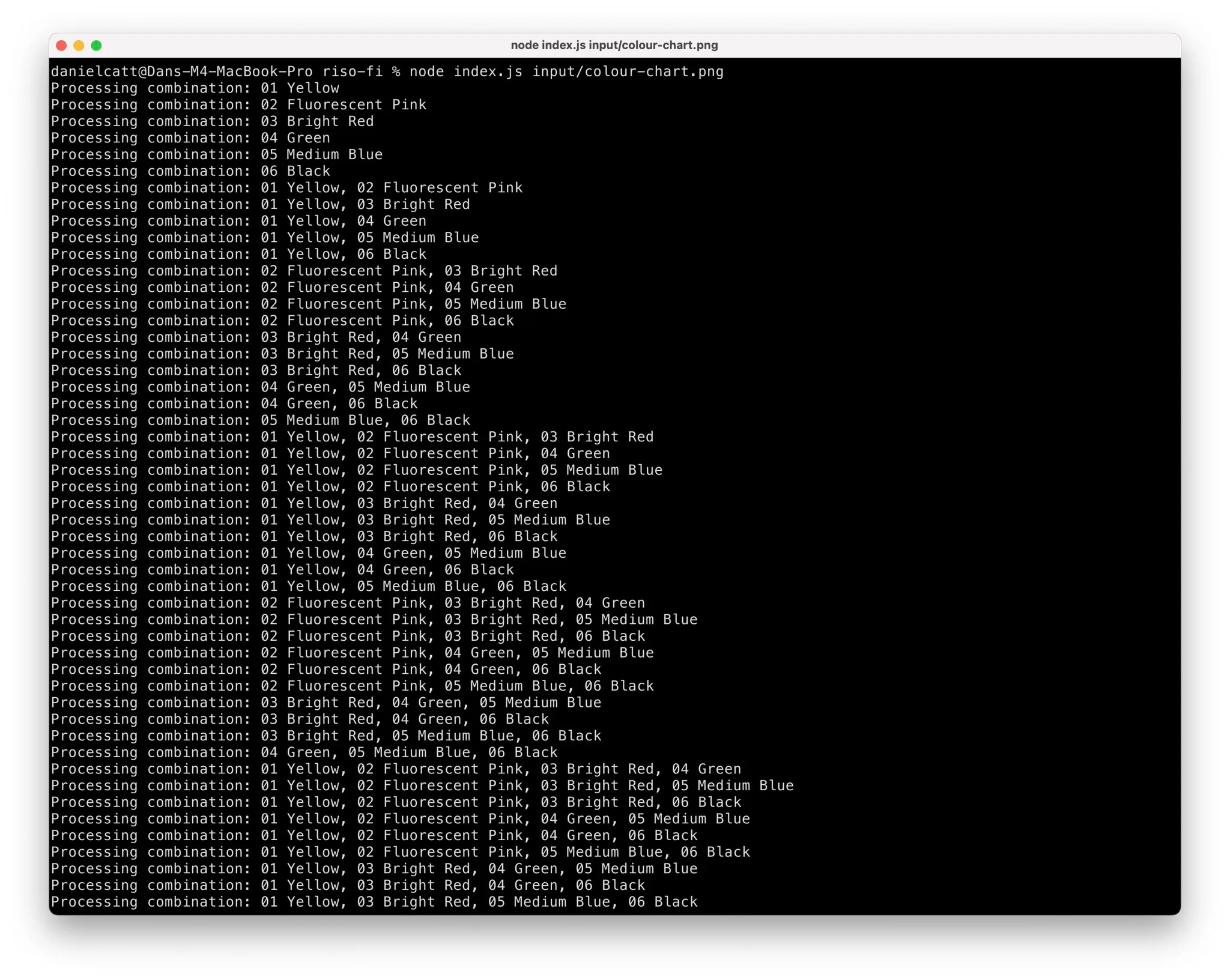
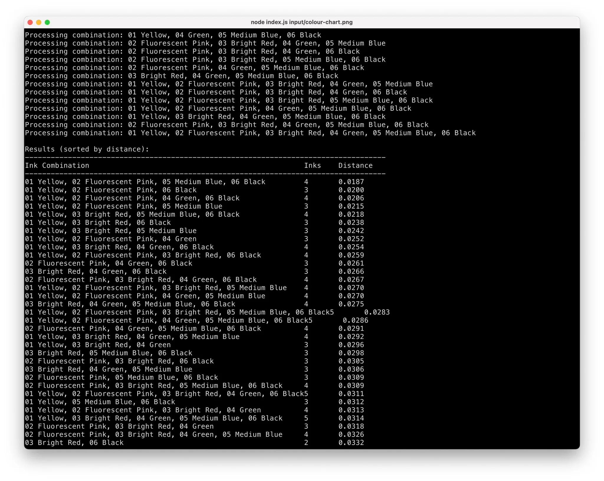
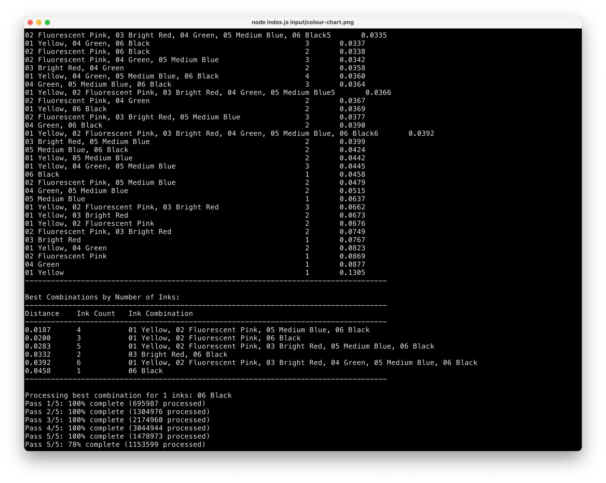
This would then generate what we call colour Look Up Tables; 'LUTs'.
Given an image, and any of our six ink colours, the code could then open up the correct LUT find the colours we were aiming for and see how to combine the inks to get there.
If we were trying to print some oranges using Black, Yellow, Pink and Green, we'd load in the Black+Yellow+Pink+Green LUT and find closest match to the orange colours we wanted to hit and grab the mix from there. And if we said we were using Black+Green we'd try our best, but probably end up with grey being the closest match.
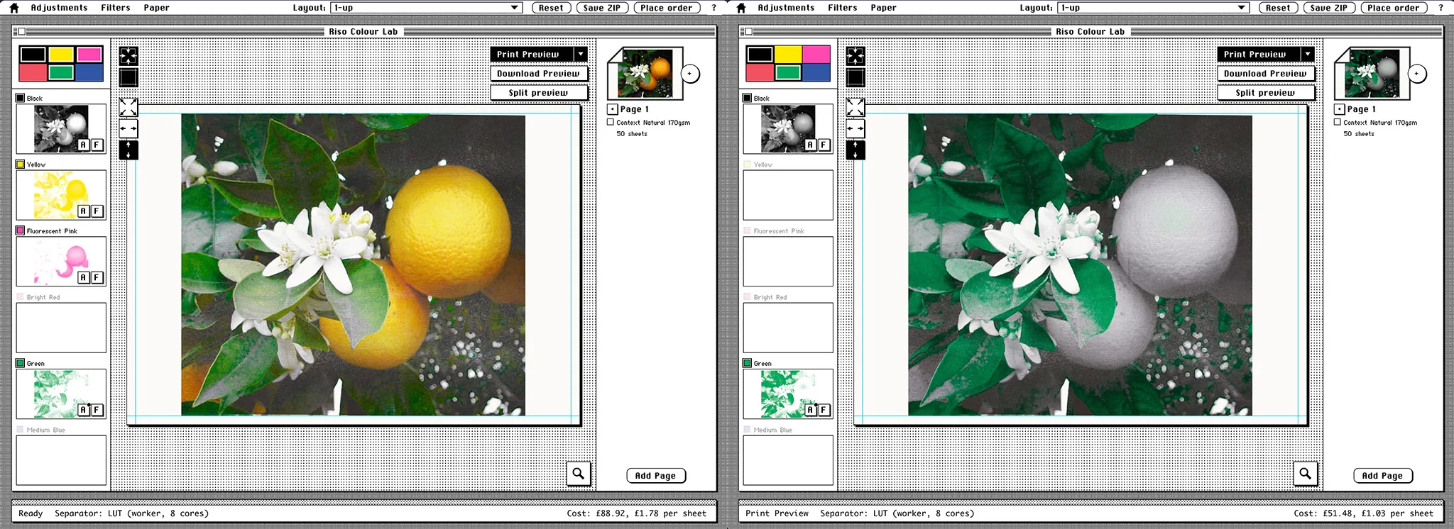
With the first stab at the LUTs done, the next thing was to feed the known colour chart in, export the results...
...send them through the riso...
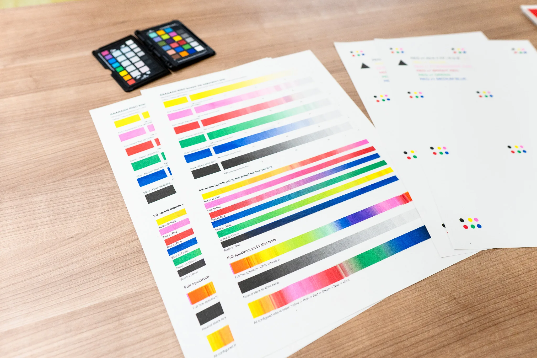
...and then scan the whole thing in, and compare the end result with the original chart, to get a better idea of how close or far the calculations were.
The next utterly horrid part was creating several variations of the LUT files, putting the chart back through the Colour Lab for each variation, printing the results, scanning the results again, and seeing if any of the new variations got us even closer or further away from what we wants. Which then got repeated several times.
This whole thing took about three weeks 😭
It's still not perfect, far from it, and for any other colour combinations for ink we don't have we'd still suggest Spectrolite, but we're going to say that this is our flavour of colour separation that works for our studio.
Thankfully, now we've gone through the process, adding a new ink colour - once we've saved up enough to buy another drum - should be a lot easier. We won't have to recalculate everything from scratch, but it would probably still take a few hours.
However if we got to about 12 different colours we may have to rethink the whole thing and get a bit smarter than just brute-forcing the numbers.
But that's a problem for another day.
🌈 🌈 🌈 🌈 🌈
The end
Just gunna come out and say it, we think the Colour Lab is pretty awesome.
Not just for people wanting to print with us, and for us managing the printing jobs, but for people who don't live in the UK (which is where we're based and where we ship to) who maybe want to colour separate out images into the six most commonly used Riso ink colours, and grab the files to take to their own local Riso printer studio.
Or people who just want to apply a 'riso effect' to an image.
And we're happy the community can use it for both of those things.
It's not a universal colour separator - as fantastic as that would be - it's still very much a tool that serves a specific purpose: making printing with us easier.
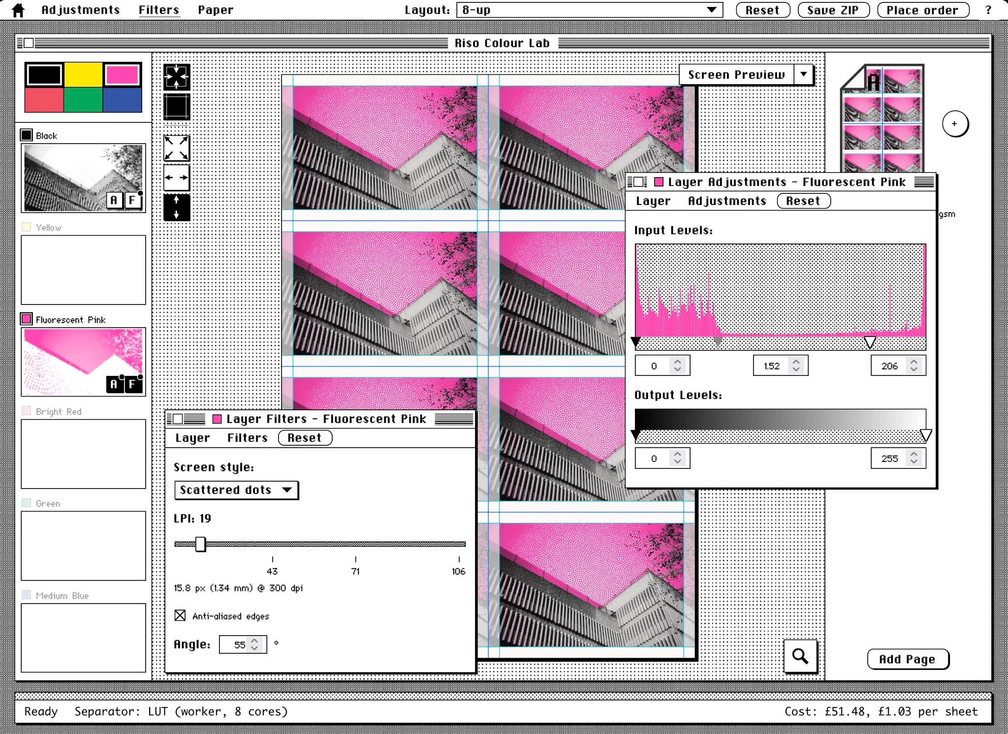
There's a couple of other things I didn't cover, which is in the Colour Lab Guide; namely being able to adjust curves, levels and adding halftones. Which are the most commonly used adjustments; curves & levels to punch-up the greys and fix the contrast, the halftones to cover up low-resolution images and overly jpeg-ed photos.
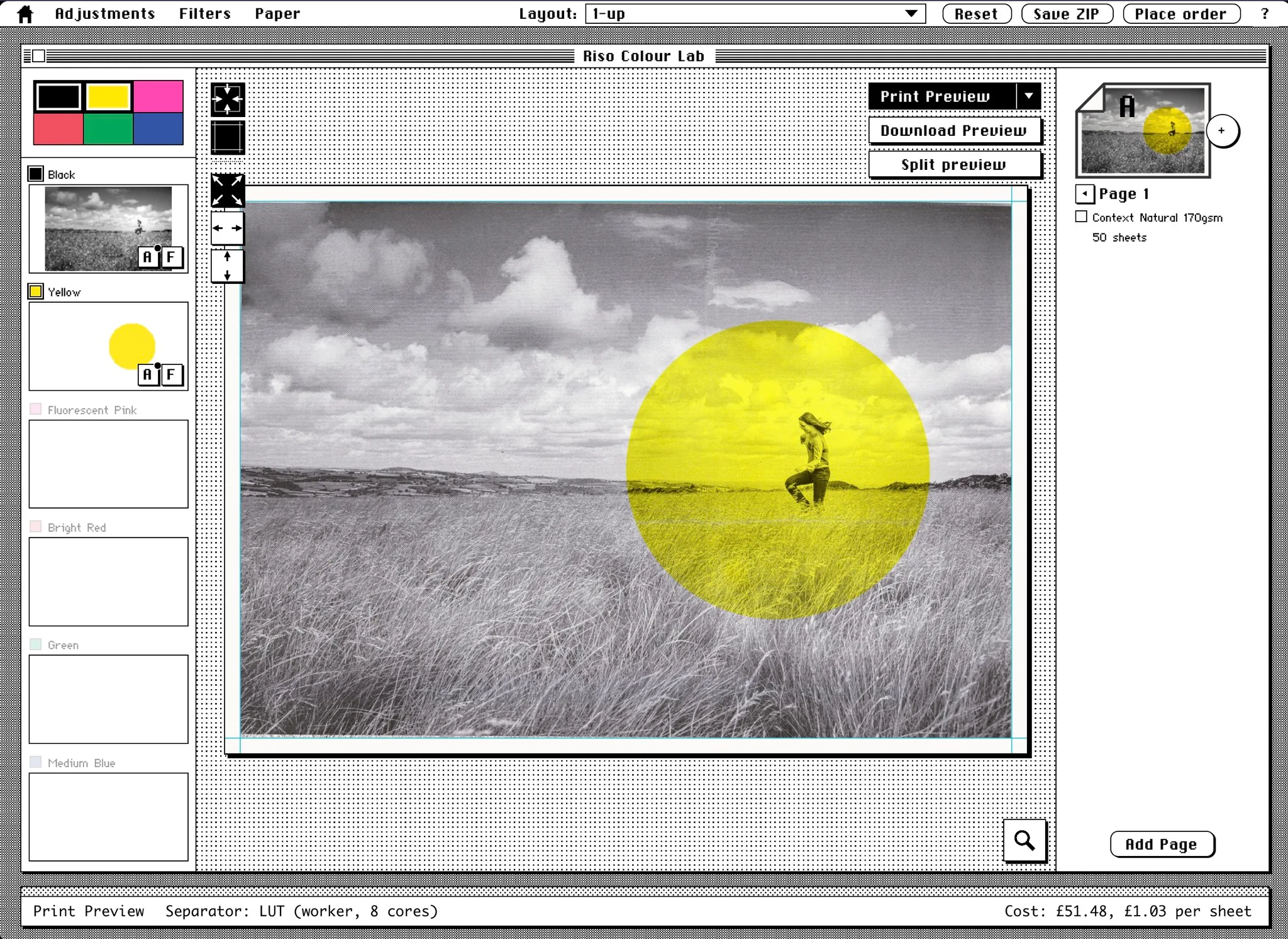
And there's a couple more things Dan wants to add; drawing simple shapes and adding masks - 'cause adding a coloured circle over a monochrome image goes a long way 😁
Gosh, we didn't even mention the layout options!
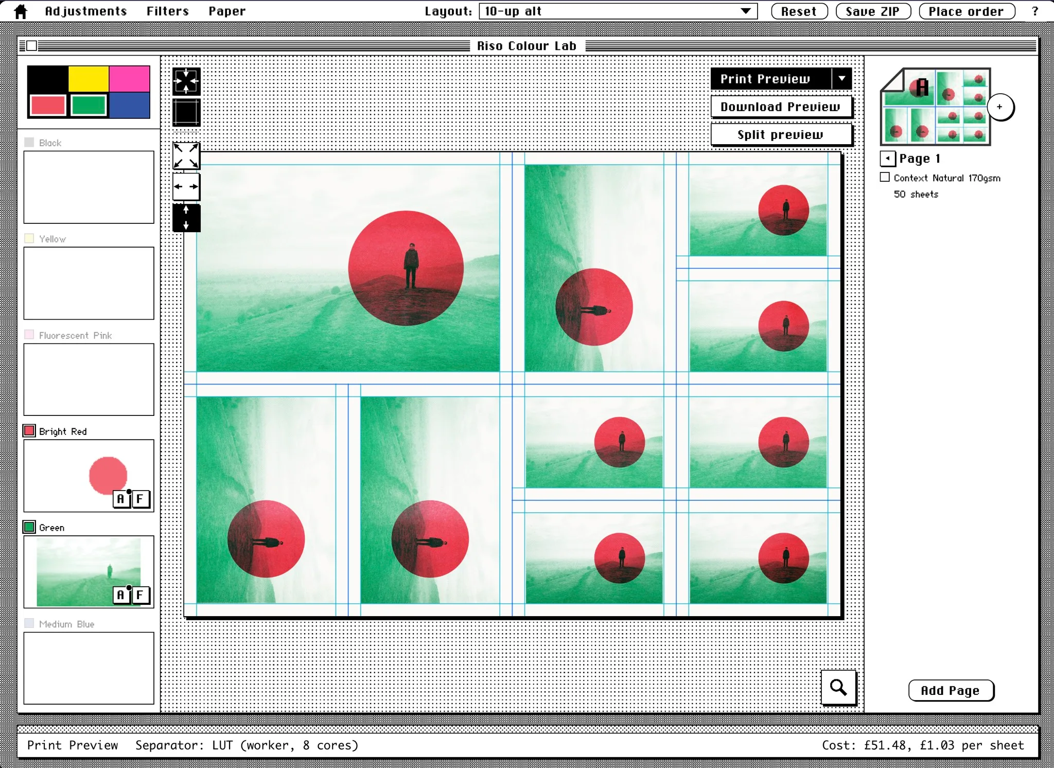
We're really looking forwards to seeing what people do with it, and the prints that come into the studio from it.
It's going to be a fun time for riso printing!
🌈 🌈 🌈 🌈 🌈